Not Found
Not Found
Not Found
Not Found
Not Found
Not Found
Not Found
Not Found
Not Found
Not Found
Not Found
Not Found
Not Found
Not Found
Not Found
Not Found
Not Found
Not Found
Not Found
Not Found

Submitted

Mobile first using flexbox

@gfontorbe

Desktop design screenshot for the 3-column preview card component coding challenge

This is a solution for...

  • HTML
  • CSS
1newbie
View challenge

Design comparison


SolutionDesign

Solution retrospective


I am trying to get better at HTML semantics and CSS responsiveness, any comment is welcome!

Community feedback

P
Grace• 27,950

@grace-snow

Posted

Hi

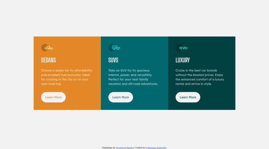
The only real problems I see here are that you can't have multiple h1s on a page, only one. And font size must never be in pixels.

Other than that, all is fine but the sizes aren't quite matching up to the design so maybe see if you can tweak little bits to get it closer.

I'd also recommend thinking about class and variable naming a bit more... They're fine. They work. But they are very related to the content at the moment. You could name things in a more generic way... But naming is always difficult and some of that comes naturally with time so don't worry too much about it. I'm just mentioning as something you might want to think about / read about.

Best wishes to you

1

@gfontorbe

Posted

Hi Grace,

Thanks for the comments.

I'll open a thread on the #best-practices channel when I get a bit of time. I keep reading contradictory information about the multiple h1 problems. We can discuss that there. I'll share links and open questions.

Noted for the font sizes, I thought I had everything on rem. I'll check that.

I'll have a look at others' naming styles for classes and get some reading done!

Cheers

0
P
Grace• 27,950

@grace-snow

Posted

@gfontorbe I'm surprised you've ever heard a debate on multiple h1s, that's been an established standard for a long time. It doesn't hurt google SEO like it used to, but can make things difficult for assistive tech, meta data and other search engines

0
Raymart Pamplona• 16,140

@pikapikamart

Posted

Hey, great work on this one. The layout seems fine in desktop and in mobile is good as well and glad that you are not using height: 100vh. I see a lot using that and I recommend not doing it. So great job.

In terms of UI.

  • Adding a padding from all directions of the body tag will be really awesome so that when resizing or opening up dev tools at the bottom. There will be a space so that your layout won't be touching the sides, flooring and ceiling of the viewport.

Only that. You did a really awesome solution here^^

0

@gfontorbe

Posted

Hi!

Thanks for the padding suggestions, I will pay attention to the padding on my next submissions.

I have been focusing mainly on the backend side of web dev so far, and I realized quickly that my frontend skills really sucked :P (meaning the design and structure didn't look nearly professional enough to show to potential employers). On my journey to transition career so all the comments and help I'm receiving from this community has been an incredible leap forward.

0

Please log in to post a comment

Log in with GitHub
Discord logo

Join our Discord community

Join thousands of Frontend Mentor community members taking the challenges, sharing resources, helping each other, and chatting about all things front-end!

Join our Discord