Not Found
Not Found
Not Found
Not Found
Not Found
Not Found
Not Found
Not Found
Not Found
Not Found
Not Found
Not Found
Not Found
Not Found
Not Found
Not Found
Not Found
Not Found
Not Found
Not Found

Submitted

Mobile first using HTML and CSS
Senay 150

@Senay-Fekadu2

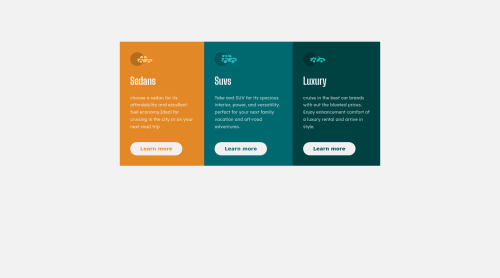
Desktop design screenshot for the 3-column preview card component coding challenge

This is a solution for...

  • HTML
  • CSS
1newbie
View challenge

Design comparison


SolutionDesign

Solution retrospective


do you think the mobile version width is too big ? I was wondering and I just went with these tell me if it is not good in respective of UI design principle if I should avoid it for the future

Community feedback

anna 340

@annab6

Posted

Hello! I think you forgot about the hover effect on buttons see this https://developer.mozilla.org/en-US/docs/Web/CSS/:hover smth like this would be: .cta-btn: hover { color .... background-color... border... }

Marked as helpful

0

Senay 150

@Senay-Fekadu2

Posted

@Anna60991 I definetly forgot about those and I have updated my code but I don't think the preview is updated with my code though

0

@Ayokunle101

Posted

-the first box and third box flex items need to be given a border radius for top-left ,top-right, bottom-left, bottom-right edges

Marked as helpful

0

Senay 150

@Senay-Fekadu2

Posted

@Ayokunle101 I forgot about and I gave the border radius 0em I was going to come back to it and I forgot thankyou

0

Please log in to post a comment

Log in with GitHub
Discord logo

Join our Discord community

Join thousands of Frontend Mentor community members taking the challenges, sharing resources, helping each other, and chatting about all things front-end!

Join our Discord