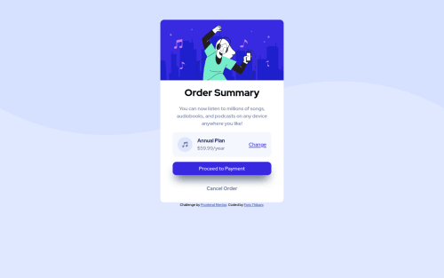
Mobile First, Vanilla CSS

Solution retrospective
Thanks to the Frontend Mentor Community. All are welcome to give feedback. This is part of the refactor an modularity review so thanks! See you next time.
Please log in to post a comment
Log in with GitHubCommunity feedback
- @AdrianoEscarabote
Hi Faris Thibani, how are you?
I really liked the result of your project, but I have some tips that I think you will enjoy:
To center the card in the center of the screen, we can use
flex-box, like this:body { display: flex; align-items: center; justify-cotent: center; flex-direction: column; }To prevent the background image from breaking at higher resolutions, we can prevent this in two different ways:
-
Add a
background-repeat: repeat-x;, the image will repeat on the horizontal axis, preventing it from breaking. -
Add a
background-size: 100% 50vmin;, the50vminwill set its height as the page target, and100%will make it stretch on the horizontal axis.
Feel free to choose one of the two!
The rest is great!
I hope it helps... 👍
Marked as helpful -

Join our Discord community
Join thousands of Frontend Mentor community members taking the challenges, sharing resources, helping each other, and chatting about all things front-end!
Join our Discord