


Szymon Rojek• 4,540
@SzymonRojek
Posted
Hi Stephen,
Really good project :D
A few tips below:
- remove CSS styles from the HTML and transfer them to the CSS file;
- possibly you can add the header tag and blocquote inside of the article;
- probably you don't need a div container for an image;
- alt text => don't need to use words like picture, image, photo, icons in the alt text as it's already announced as being an image. You can just simply type a name of this person, for example: alt="Daniel" (when the icons / img have only a decorative role - then alt text should be provided as a empty (alt="") so these icons can be ignored by assistive technologies, such as screen readers);
- I'd recommend learning BEM naming convention;
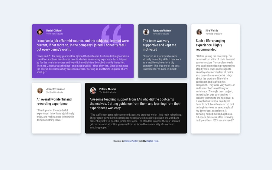
- RWD: check a project in your browser by using the inspector on different devices => practically you have created mobile version till 980px (approx). In my opinion you can change the pattern and create another breakpoint for tablets: two rows with two boxes and below them another box the 5th (person Kira) along the length of the entire container. You will see, all content will be well-positioned (not tight).
Ps. Don't forget to upvote any comments on here that you find helpful.
Greetings :D
1
Stephen Tyers• 235
@stephentyers1975
Posted
@SzymonRojek Thanks for the feedback on naming conventions and HTML attributes. At this stage, I've just been focusing at the moment on getting the CSS correct to match the visual design spec. Regarding the different screen sizes, I just created what was detailed in the specification, but in real life, I agree that there should be some more layout tweaks for tablet. Maybe remove the grid-template-areas and just leave it at 2 rows and two columns and let the implicit grid wrap the 5th for that size Many thanks for your help Steve
0
