Not Found
Not Found
Not Found
Not Found
Not Found
Not Found
Not Found
Not Found
Not Found
Not Found
Not Found
Not Found
Not Found
Not Found
Not Found
Not Found
Not Found
Not Found
Not Found
Not Found

Submitted

Mobile first with sass, flexbox and grid.

KT 390

@KtGitIt

Desktop design screenshot for the Fylo landing page with two column layout coding challenge

This is a solution for...

  • HTML
  • CSS
2junior
View challenge

Design comparison


SolutionDesign

Solution retrospective


Greetings All,

Any feedback on overall result or HTML and scss/css code structure highly appreciated.

While scaling narrow, Images shrink because of responsive nature but I think it dosen't look quite good. Any suggestion on How to make it look better?

Regards, KT

Community feedback

P
ApplePieGiraffe 30,565

@ApplePieGiraffe

Posted

Hi, KT! 👋

Good job on this challenge! 👏 Your solution looks pretty good and so does your HTML! 👍

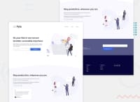
I think the shrinking of the images on the page due to a decrease in screen width doesn't look too bad, but if you'd like them to not get so small (which might look a little funny), you could consider switching to a tablet/mobile layout a little sooner.

Besides that, the only super minor suggestion I have is to add some space between the "Stay productive, wherever you are" heading and the image above it in the mobile layout (since the two are quite close to each other, at the moment). 😉

Keep coding (and happy coding, too)! 😁

1

KT 390

@KtGitIt

Posted

Hi @ApplePieGiraffe ,

Thanks for suggestion. I will add some padding. I appreciated you taking time out and providing feedback!!👏🏼 👏🏼 👏🏼

0

Please log in to post a comment

Log in with GitHub
Discord logo

Join our Discord community

Join thousands of Frontend Mentor community members taking the challenges, sharing resources, helping each other, and chatting about all things front-end!

Join our Discord