Submitted over 3 years agoA solution to the NFT preview card component challenge
Mobile landing page using CSS flexbox

@Babray03
Code
Please log in to post a comment
Log in with GitHubCommunity feedback
- @fraserwat
This is looking really nice!! Only things I'd change:
- Add a bit of
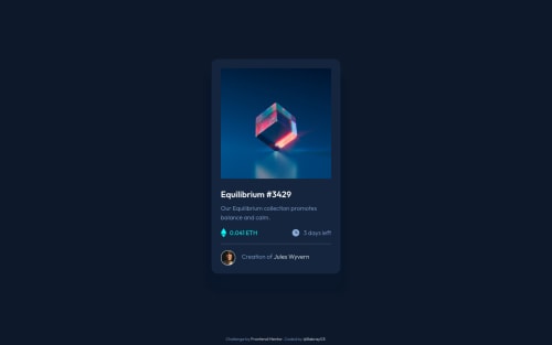
border-radiusto the image - Simplifying the HTML a bit - if you've got the <main> as a container, does it need the
<div class="container">? - Using semantic HTML. The .attribution component can be a <footer>, what do you reckon the .card component should be?
Keep it up! Fraser
Marked as helpful - Add a bit of
- @RaiIsNotYourGuy
Overall, very good. The border for the image and hover-image are rounded in the sketch-up. Only thing I can see.
- @RioCantre
Hello there! Awesome job with this project. Viewing your solution, I would suggest the following for you...
- Add
border-radius: 10px;in the.card-imgand.card-img__overlay - Instead of wrapping the whole part with
ato make it a link, it can be simplified with justdivand add hover state
<div class="card-img__container">
        <img src="images/image-equilibrium.jpg" alt="cube" class="card-img">
        <div class="card-img__overlay">
               <img src="images/icon-view.svg" alt="eye icon">
        </div>
</div>
Hope this helps and Keep it up!
- Add


Join our Discord community
Join thousands of Frontend Mentor community members taking the challenges, sharing resources, helping each other, and chatting about all things front-end!
Join our Discord