Mobile (Portrait and Landscape) Responsive Solution Using CSS Flexbox

Solution retrospective
-
For the Mobile version in landscape mode, I used the desktop design and I made the page scrollable. Is this a good responsive approach?
-
I used FontAwesome 5 for the 'shopping cart' icon. Is there any other solution to add an icon? If so, which method would you recommend?
-
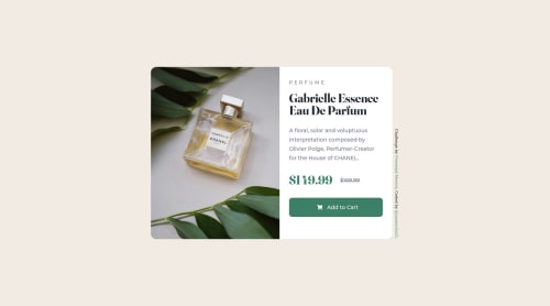
For the image part of the card, I created a 'div' with the perfume image as the 'background-image' and I set 'background-size: cover'. Could you please recommend me a more optimized solution for this or is my solution good enough?
Also, if possible, I would like an overall feedback of my solution, because there is always room for improvement.
Please log in to post a comment
Log in with GitHubCommunity feedback
- @AdrianoEscarabote
Hello everything is fine?
I really liked the result of your project, but I have some tips that I think you will like:
1- Document should have one main landmark, you could have put all the content inside the
maintag. click here to read about it2- I noticed that you used a fixed measurement unit to adapt the layout on small screens, prefer to use relative measurement units, as they automatically adapt to any screen size, in addition to saving a lot of lines of code.
The rest is really good! Hope it helps... 👍
Marked as helpful

Join our Discord community
Join thousands of Frontend Mentor community members taking the challenges, sharing resources, helping each other, and chatting about all things front-end!
Join our Discord