Not Found
Not Found
Not Found
Not Found
Not Found
Not Found
Not Found
Not Found
Not Found
Not Found
Not Found
Not Found
Not Found
Not Found
Not Found
Not Found
Not Found
Not Found
Not Found
Not Found

Submitted

Mobile Responsive Single Price Grid Component Built with Grid & Flex.

#accessibility#bem
Johnny 470

@johnnysedh3lllo

Desktop design screenshot for the Single price grid component coding challenge

This is a solution for...

  • HTML
  • CSS
1newbie
View challenge

Design comparison


SolutionDesign

Solution retrospective


hey everyone, I'm super grateful to everyone giving me feedback every since i started these challenges. your words have really helped me grow to understand alot more about development so i say Thank you so much.

here's another challenge I've completed.

  • the one uncertainty i have is not using grid as well, still getting used to it 😅. so if you have any comments about that or my solution in general, please know that i am open to learn from you. thank you

this observation is after i submitted

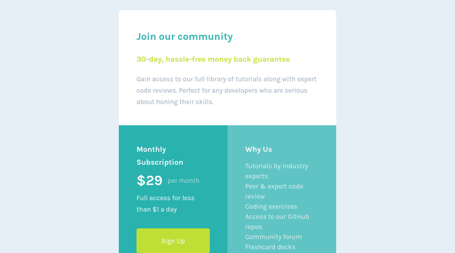
  • i noticed my solution in comparison to the design was looking a little squished. can anyone help me with that? I've ran out of ideas 🤖

Community feedback

Lucas 👾 104,580

@correlucas

Posted

Hello Johnny, congratulations for your solution!

An alternative to create this grid layout is creating a grid like this grid-template-column: 1fr 1fr 1fr 1fr and set to the bigger row grid-column: span 2 then for the mobile version set the grid-template-column: 1fr for a single column and each in a different row.

But anyway you did it right, this is just another way to build it.

Marked as helpful

1

Johnny 470

@johnnysedh3lllo

Posted

ayee! thanks for the feedback bro. i did try this approach initial but it was acting a bit weird so i went with this one 😅. although i add a max width tho. i wanted to ask if i had to do that?

0
David 8,000

@DavidMorgade

Posted

Hello and congrats on finishing the challenge!

Like Lucas said you could definitely go for a four column grid, you could also get them with grid-template-columns: repeat(4, 1fr) this will get you exactly 4 columns with the same size!

Also, your project looks fine, maybe a bit bigger than normal, are you using a little monitor when you are doing your challenges? or maybe you have you screen with a bit of zoom?, anyway you can fix it by reducing a bit the paddings and the sizes of the font and boxes, don't worry about that, it still looks good! Good job.

Hope my feedback helped you!

1

Johnny 470

@johnnysedh3lllo

Posted

thanks david, I'll try using the grid-template-columns method instead.

1

Please log in to post a comment

Log in with GitHub
Discord logo

Join our Discord community

Join thousands of Frontend Mentor community members taking the challenges, sharing resources, helping each other, and chatting about all things front-end!

Join our Discord