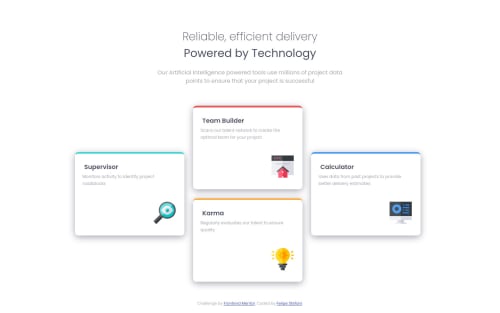
Submitted over 3 years agoA solution to the Four card feature section challenge
Mobile using flex and desktop using grid

@felipestefani
Solution retrospective
Hey, guys! How are you?
I'm looking for best practices and improvements I could've be done in my project.
In the Desktop layout I`ve changed the font-size to 12px and the cards get a bit smaller because I tried to fit them in a 1024px layout, and without the sketches it gets a little difficult.
Besides that, could you help me pointing what is right/wrong and what would you do in a different way?
Thanks to you all!
Code
Loading...
Please log in to post a comment
Log in with GitHubCommunity feedback
No feedback yet. Be the first to give feedback on Felipe Stefani's solution.
Join our Discord community
Join thousands of Frontend Mentor community members taking the challenges, sharing resources, helping each other, and chatting about all things front-end!
Join our Discord