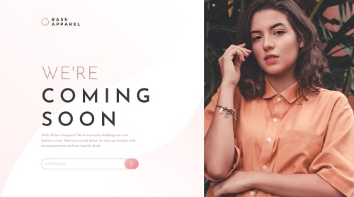
Mobile-first and responsive base-apparel-coming-soon design

Solution retrospective
I used css grid for this challenge. The mobile first went easy but I found it difficult to place things in the desktop approach; I was able to do it properly once I used some properties of css grid like align-self. I couldn't do a few things properly: applying the background svg in desktop version in a good way, **box-shadow for the button **(I was tired of finding the correct values for box-shadow so I skipped that) and in desktop version I couldn't shrink the outer container properly, so there is a small space left at the bottom of the image in desktop version, although it is faintly visible I need to find a way to fix it. There is an accessibility issue with the images. So, feedback in these areas as well any part you think can be improved would be helpful.
Please log in to post a comment
Log in with GitHubCommunity feedback
No feedback yet. Be the first to give feedback on HYDROCODER's solution.
Join our Discord community
Join thousands of Frontend Mentor community members taking the challenges, sharing resources, helping each other, and chatting about all things front-end!
Join our Discord