


@aUnicornDev
Posted
The issue that you are saying about things being centered, is not about alignment but is about the scale.
The screenshot taken is at 1440px width of the browser.
Compare the size of the .container of your site at 1440px width and the size of the same container given in the comparison.
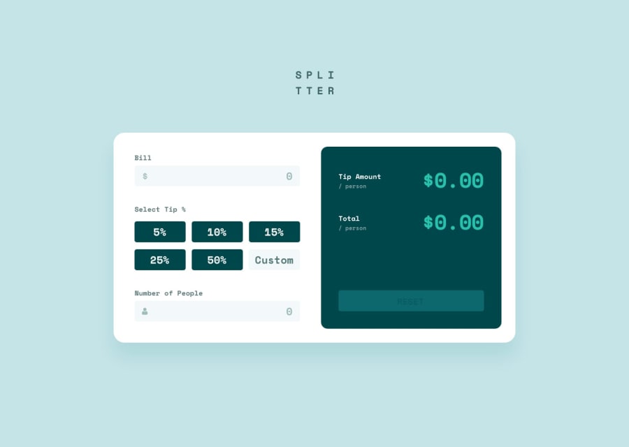
1.The border used on :active states shifts the components a little..
Try using box-shadow: inset 0px 0px 0px 2px #26c0ab; instead of a border.
2.Two click are required to apply the tip amount when it should apply only on a single click.
3.The Tip amount and total card changes dimensions as applying tip. Try defining a fix width for this card and make the padding variable between label and amount.
@HYDROCODER
Posted
@aUnicornDev Thank you for your feedback! :)
Regarding the dimension changes, I need to work on it but I am not aware of any major issues it brings forth, so if you know more about it do tell (or any resource you know of).
Regarding the two-clicks, I honestly don't know how to correct it. I used blur event listeners for all the inputs, as there is no submit button in there to determine the perfect time to calculate the total amount; it works such that once the focus on the inputs is taken away (by clicking anywhere else out of the input areas), it computes the bill and the tip; this may be the reason for double clicks: one for which-ever input out of the three is given last by the user, and the other to remove the focus. I found this logic more appealing to calculate the bill. Should I use 'change' event listener instead of 'blur'? Your suggestions would be helpful here.
@aUnicornDev
Posted
@HYDROCODER Did you try and use the 'click' event?
@HYDROCODER
Posted
@aUnicornDev I changed the event listener to 'input' instead of blur and it works whenever the user changes the input and without any double clicks. I did make the changes you suggested above and it does work better now, you may check it out again. Thank you :).
@aUnicornDev
Posted
@HYDROCODER Great Work!
And I was not hoping you would make all the changes related to positioning, But u did and it looks much better. I point these things out because it gives me chance to a better User Interface Designer and I'm so happy that u made all those changes.
