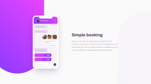
Submitted about 4 years agoA solution to the Chat app CSS illustration challenge
Mobile-first chat app illustration

@spencerrunde
Solution retrospective
Really interesting challenge! I liked the focus being primarily on CSS for this one. I know the font and phone in general may look a little small, but I was following the design for this one pretty heavily, and it matches up really well.
Code
Loading...
Please log in to post a comment
Log in with GitHubCommunity feedback
No feedback yet. Be the first to give feedback on Spencer Runde's solution.
Join our Discord community
Join thousands of Frontend Mentor community members taking the challenges, sharing resources, helping each other, and chatting about all things front-end!
Join our Discord