Not Found
Not Found
Not Found
Not Found
Not Found
Not Found
Not Found
Not Found
Not Found
Not Found
Not Found
Not Found
Not Found
Not Found
Not Found
Not Found
Not Found
Not Found
Not Found
Not Found

Submitted

Mobile-First Design using CSS Grid, Flexbox & Sass

@Rabin92

Desktop design screenshot for the Testimonials grid section coding challenge

This is a solution for...

  • HTML
  • CSS
2junior
View challenge

Design comparison


SolutionDesign

Solution retrospective


Any feedback would be greatly appreciated.

Community feedback

P
ApplePieGiraffe 30,545

@ApplePieGiraffe

Posted

Hey, Rabin Gharti Magar! 👋

Nice work! Your solution looks good and is responsive! 👍

I only suggest setting a max-width on the testimonial cards and centering them in the page when the layout changes from desktop to mobile so that they aren't too wide when the layout first changes. 😉

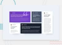
I like how you remembered the box-shadow around the testimonial cards (a detail often overlooked in this challenge).

Keep coding (and happy coding, too)! 😁

1

@Rabin92

Posted

Thank you very much for your feedback!

A very helpful suggestion, I will make those changes.

0

Please log in to post a comment

Log in with GitHub
Discord logo

Join our Discord community

Join thousands of Frontend Mentor community members taking the challenges, sharing resources, helping each other, and chatting about all things front-end!

Join our Discord