Mobile-first Flexbox approach HTML CSS solution

Solution retrospective
My approach
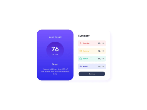
This is my first challenge that I have attempted using frontend mentor. I recently learnt about the mobile first development approach and wanted to try it out. I figured since the layout was simple enough, I could use flex for everything. I never used the dynamic values provided and have hardcoded them up. I could not get the design as it is because I did not have the Figma file with all the spacing, fonts so I have guessed most of things.
Some questions I had for the community
- Is this approach feasible? While I jumped from mobile to a desktop version, I had to make quite a few changes as I had set margins and paddings for everything but I am not sure how scalable it would be if more features are added.
- The mobile view is somewhat broken. I had given different heights to the section maybe that is the reason behind it.
If you could review and give feedback on the code, it would be highly appreciated :)
Please log in to post a comment
Log in with GitHubCommunity feedback
No feedback yet. Be the first to give feedback on amoeba25's solution.
Join our Discord community
Join thousands of Frontend Mentor community members taking the challenges, sharing resources, helping each other, and chatting about all things front-end!
Join our Discord