Mobile-first Order Summary Component Using HTML, Scss, Flexbox

Solution retrospective
I finished this project today and I tried to correct certain mistakes I made on my last solution regarding accessibility. I had to do the #nomouse challenge working around the Order Summary with just the keyboard. I also added label elements with screen-reader users in mind. I'm trying to fine tune my consciousness on writing code that is accessible to different users. Please feel free to run through my code. I'm open to receiving positive feedback. Thanks!
Please log in to post a comment
Log in with GitHubCommunity feedback
- @vanzasetia
Hi there! 👋
You've got a lot of feedback from some people. So, I'm just going to give one or two pieces of feedback on this solution.
- Firstly, I suggest using
remforfont-size. It's important to make sure that it scales properly when the users change their default font size setting. - Secondly, I agree with @FluffyKas that only use
aria-labelif there's no visible text like icon buttons (e.g. Twitter "love" button, etc).
Anyway, I decided to create a page where there's visible link text and
aria-label. I tested it with Narrator in the Chrome browser, and here's the result.- Once the page is loaded, Narrator reads the visible text and ignores the
aria-label. - After I tab (focus) to the link, Narrator reads the
aria-labeland ignores the visible text. - By the way, here's the HTML markup that I tested.
<a href="/" aria-label="screen reader please read me">I just read the visible text</a>I suggest you to read this article by Josh Comeau about pixels and rems units. It's an amazing article that will tell you when to use
pxand when to userem.So, that's it! Hope it's useful and sorry for the late reply. 😅
Marked as helpful - Firstly, I suggest using
- @Kamasah-Dickson
Your solution looks great on small mobile . To help you with the accessibility issue, wrap your card in a <main> semantic tag or you can just change the parent div of your card into main. Besides good job there👍 Happy coding💻
Marked as helpful - @FluffyKas
Heyo,
Overall this looks really good, well done! You got some advice already from others on how you could improve but since you tagged me, I try to add something useful too :)
-
Add aria-labels to elements with no visible text. These links (change, proceed to payment, cancel order) has some text content already, so by adding aria-labels the same text will be just announced twice by screen readers.
-
It would be a better idea to center your component using grid/flexbox, it's more reliable than adding margins to it.
-
You could add some transitions to the links, so their hover state looks a bit smoother!
-
For me, that
font-size: .6875remlooks way too small for the Change link, perhaps it could be a tiny bit bigger.
Also, if I understand right, you were aiming to make this component keyboard-compatible? What did you add exactly? I tried navigating through it only with my keyboard (also checked the css, to be sure) and I don't see anything but the default browser focus (which btw is really barely visible with the color-theme of this challenge, so I suggest adding some custom focus to it.)
Marked as helpful -
- @Samadeen
Hey!! Cheers 🥂 on completing this challenge.. .
Here are my suggestions..
- You can wrap your attribution section in a footer tag to avoid accessibility issues.
- You should add some
margin-topto your container to push it down a little
This should fix most of your accessibility issues
. Regardless you did amazing... hope you find this helpful... Happy coding!!!
Marked as helpful - @Sdann26
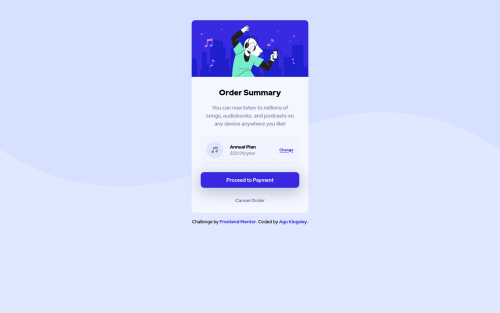
I would tell you to note that the words "Order Summary" and "Annual plan" have a different color, which you should change. If I am not mistaken it is this color which they have:
color: hsl(223, 47%, 23%).Marked as helpful - @didyouseekyng
@samadeen, @Sdann26, @vanzasetia, @Kamasah-Dickson, @FluffyKas, @grace-snow
I know you might be busy with certain things but I would appreciate it if out of your busy schedule you run through my code and help me identify areas I need to strengthen.


Join our Discord community
Join thousands of Frontend Mentor community members taking the challenges, sharing resources, helping each other, and chatting about all things front-end!
Join our Discord