Not Found
Not Found
Not Found
Not Found
Not Found
Not Found
Not Found
Not Found
Not Found
Not Found
Not Found
Not Found
Not Found
Not Found
Not Found
Not Found
Not Found
Not Found
Not Found
Not Found

Submitted

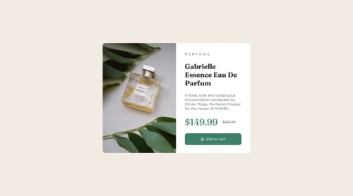
Mobile-first -product-preview-card

lij110397• 230

@lij110397

Desktop design screenshot for the Product preview card component coding challenge

This is a solution for...

  • HTML
  • CSS
1newbie
View challenge

Design comparison


SolutionDesign

Solution retrospective


What are you most proud of, and what would you do differently next time?

1. How to use preprocessor like SaSS

  • Define variables
$primary-color: #3498db;
  • Define mixin
  • Define combined rules

However, in this case, I don't think it is necessary to use SaSS, since there are limited variables.

2. How to add strikethrough

.strikethrough-text {
  text-decoration: line-through;
}

3. How to add a responsive picture The image source will change according to the media scale, instead of simply switching the size of image. source only indicate the source of the image. But most of css styles are still changed by img


This can match with media queries. The image will change and some other styles.

@media (min-width: 43rem)

What challenges did you encounter, and how did you overcome them?

When it is necessary to use preprocessor like SaSS to style the css codes? I did not use preprocessor in the project, but I still add one potential sass file if i would use sass.

What specific areas of your project would you like help with?

When it is necessary to use preprocessor like SaSS to style the css codes?

Community feedback

P
Grace• 27,870

@grace-snow

Posted

Hi, I'm afraid this overflows my screen. I'll add some Screenshots to discord so you can see the problem for yourself. There are also improvements needed in the html.

  1. This is a component that would be dropped into a larger webpage. That means the component itself must not be a main landmark. Instead if should be a div inside main and with its own class for styling the component.
  2. Similarly, this would never act as a title for a Web page, so should not be using a h1. A h2 would be more appropriate.
  3. The alt text on the image does not describe it accurately. Alt descriptions should never include words like "image" because it's already an image role. Read the post in the resources channel on discord about how to write good alt text.
  4. Similarly, the cart icon should not have any value in the alt attribute at all as it is purely decorative.
  5. The strike through text must be done with s or del tags.
  6. Get into the habit of including a full modern css reset at the start of the styles in every project. Andy Bell or Josh Comeau both have good ones you can look up and use.
  7. Style fonts and colors on the body not on the html. Try to avoid styling on html at all unless absolutely necessary.
  8. Never use width: 100vw. All that can do is cause unwanted horizontal scroll because viewport units don't account for scrollbars. So 100vw actually means "full width plus the width of a scrollbar when present". The body is already full width anyway so you don't need to give it any width-related css properties.
  9. Don't use position absolute to center the component on the screen!! You've already made the body into a flex column so I can't understand why you've added this absolute positioning anyway. It is breaking the solution because it effectively takes the component out of the flow of the document.
  10. The component must not have a width. It should only have a max width in rem. This will allow it to shrink narrower on smaller screens and using rem means it will scale correctly for all users, including those with a different text size.
  11. The component must not have a height at all. This is extremely important: Never limit the height of elements that contain text. Let the browser do it's job and decide what height is needed based on the content inside.
  12. Place border radius on the component itself instead of on the child elements. The component will just need overflow hidden to crop out the overflowing child corners.
  13. The button must not have a height either. (Same principle as no 11 above). Use padding.
  14. Check the font weights and line heights. In places your solution does not match the design closely enough.

Marked as helpful

0
lij110397• 230

@lij110397

Posted

Thank you for giving me so many suggestions!! I've learnt so much from the comment! **Things I will adopt in my code: **

  • I took your advice and put my component into <div>
  • I changed the alt of the image into <img alt="This is a perfume product."> to give more accurate description of the image.
  • I changed the using CSS style of "line-through" into semantic labels like <del> and <s>
  • I change the "width:100vw" into "width:100vw"
  • I deleted the "position:absolute" lines. (I was doing so because sometimes I found only making parent container flexbox cannot centralize the child.)
  • I change the width of component from fixed width into "max-width" and delete "height".
  • I moved the border-radius setting of product image to its parent using
  /* border radius */
  border-radius: 0.7rem;
  overflow: hidden;
  • I deleted the button's height and using the code instead.
  padding: 0.7rem;

I 've renewed the code in the github page!

0

Please log in to post a comment

Log in with GitHub
Discord logo

Join our Discord community

Join thousands of Frontend Mentor community members taking the challenges, sharing resources, helping each other, and chatting about all things front-end!

Join our Discord