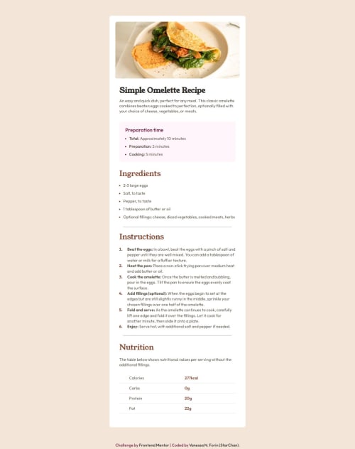
Mobile-first Recipe Main Page

Solution retrospective
Hey guys!
Thank you for being here! This is my second challenge and i'm really proud. This is my first coding a mobile-first on my own !
I studied a lot to try be more independent in projects, but i know the importance of work in a team and ask for help.
Anyways, hope you enjoy!
Waiting your feedbacks!
Please log in to post a comment
Log in with GitHubCommunity feedback
- @javascriptor1
Hi Vanessa,
Congratulations on completing your second project. Excellent job. Here are some remarks which I hope you found helpful:
HTML
- You have done a good job using semantic HTML elements. There is one tag in the ingredients section which should be change from
ul
to 'ol' ;
<ul class="instructions__list">
As this is an ordered list , the
ol
should be used.-
For alt text related to images inside HTML , and as per W3C website , you should avoid "Superfluous information in the text alternative. Usually, there’s no need to include words like “image”, “icon”, or “picture” in the alt text. People who can see will know this already, and screen readers announce the presence of an image".
-
The last row in the Nutrition section table should not have a border bottom. You have to remove the border-bottom by using
.nutrition__table tr::last-child
selector and assign valuenone
to border-bottom
CSS
-
The main container should be a little wider. This affects some content and causes extra lines for some
p
elements like the one underh1
tag. Instead of 2 lines like the design, your paragraph spans into 4 lines. -
For responsiveness, you said in a reply to one comment the following :
"I used 1440px cause was the number in the guide styler!"
When I started learning about responsiveness, and start doing FEM challenges here, I got confused just like you about the two designs ( 375 & 1440px) which appear in all challenges style guides.
The design folder for all challenges is shipped with at least 2 photos :
1- For mobile devices ( width is 375px).
2- For desktop computers ( width is 1440px).
However, your solution should be responsive even for devices that fall between these 2 sizes like 500px, 800px, and 1200px.
These 2 designs are working as a guide for you on how the mobile design should look like and how the desktop design should look like.
For example, in this challenge, The image on top should take full width (100%) on mobile devices. So you should make your design considering this and set a breakpoint as to where to break into desktop design.
If we check your solution again , try to view the design on 799px using dev tools in chrome, then go up to 800px where you set a breakpoint for desktop design.
You will see a big photo until 799px then a small container when you switch to desktop design( you set it max @ 35% of screen width). Sô, here is a problem. The screen is 800px and the container is only 35% wide of the screen which is very small.
So, To code it right, whenever you break into the desktop design, the page should look like the same one provided in the design folder for desktop view.
I hope it's clear now for you.
- There are some declarations in CSS which have no effect as they are default values. Examples of this are the following ( see the last commented two declaration) :
.table__infos { font-family: var(--secondary-font); color: var(--wenge-brown); /* font-size: 16px; */ /* font-weight: 400; */ }
When you finish styling, try to clean up your CSS files by removing all declarations which have no effect.
Best of Luck and keep coding.
Regards,
MKF
Marked as helpful - You have done a good job using semantic HTML elements. There is one tag in the ingredients section which should be change from
- @petritnuredini
First of all, congratulations on completing your Frontend Mentor project! It's a significant achievement to take a concept and turn it into a functioning webpage. Here are some best practices and suggestions to further refine your work:
HTML & CSS Best Practices:
- Semantic HTML: Great use of semantic elements like
<main>
,<section>
, and<footer>
. This helps in making your HTML more readable and accessible. - Responsive Images: You've included separate images for desktop and mobile. Consider using the
srcset
attribute in the<img>
tag for responsive images. This allows the browser to choose the most appropriate image source based on the screen size. - CSS Variables: Excellent use of CSS variables for managing colors and fonts. This makes your CSS more maintainable and easier to update.
- Avoid Redundant Code: In your CSS, you've declared
font-family: var(--secondary-font);
twice in.headtext__description
and.nutrition__text
. Removing duplicate code will make your stylesheets cleaner.
Accessibility:
- Alt Attributes: Good job using alt attributes for images, ensuring that your site is more accessible.
- Contrast Ratios: Make sure the text colors and background colors have enough contrast to be easily readable, especially for users with visual impairments.
Performance:
- Font Loading: You have multiple
<link>
tags for Google Fonts withpreconnect
, which can be combined into one to reduce HTTP requests and improve page load performance.
Code Organization:
- CSS Organization: Consider organizing your CSS by grouping related styles together. It’s also a good practice to comment sections of your CSS for better readability.
Learning Resources:
- To learn more about responsive images, check out MDN's Responsive Images Guide.
- For improving accessibility, WebAIM is a great resource.
- To optimize web performance, Google's web.dev offers excellent tips and tools.
Keep up the great work, and remember, every project you complete takes you one step closer to mastering front-end development. Your progress is commendable, and with continuous learning and application of best practices, your skills will only grow stronger!
Marked as helpful - Semantic HTML: Great use of semantic elements like
- P@danielmrz-dev
Oi Vanessa!
Seu projeto ficou ótimo!
Tenho uma sugestão:
- Na sua lista
<ul class="instructions__list">
, ao invés de usar<ul>
(unordered list), você pode usar uma<ol>
(ordered list).
Assim você tem a opção de ordenar a lista com números, letras, algarismos romanos, etc. Usando
<ol>
, você não precisa usar o::marker
em cada um dos<li>
.Espero que ajude!
Fora isso, seu projeto ficou fantástico!
Marked as helpful - Na sua lista
- @MariusG1991
Hi Vanessa
Great work! One thing I would change is media query break point. Instead of
1440px
I would use something around700px
or800px
, so it's not growing to big. You can try it 😉
Join our Discord community
Join thousands of Frontend Mentor community members taking the challenges, sharing resources, helping each other, and chatting about all things front-end!
Join our Discord