Not Found
Not Found
Not Found
Not Found
Not Found
Not Found
Not Found
Not Found
Not Found
Not Found
Not Found
Not Found
Not Found
Not Found
Not Found
Not Found
Not Found
Not Found
Not Found
Not Found

Submitted

Mobile-First site using CSS Grid, Flexbox & Sass

Rabin Gharti Magarโ€ข 455

@Rabin92


Design comparison


SolutionDesign

Solution retrospective


Any feedbacks are greatly appreciated!

Community feedback

P
ApplePieGiraffeโ€ข 30,545

@ApplePieGiraffe

Posted

Hey, Rabin Gharti Magarโ€”good job on another challenge! ๐Ÿ‘

Your solution looks good and responds well! ๐Ÿ‘

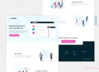
Just a super tiny suggestion but I think a slightly subtler box-shadow on the feature boxes (as in the original design) would be a nice touch! The copyright text in the footer of the page could also be made a little smaller so that it draws less attention than the rest of the info in of the footer. ๐Ÿ˜‰

Keep coding (and happy coding, too)! ๐Ÿ˜

1
Anna Leighโ€ข 5,135

@brasspetals

Posted

Hi, Rabin! Congrats on completing another challenge! ๐ŸŽ‰

A few suggestions:

  • For better alignment of the text in the cards on desktop, add align-items: center to the card and remove the large top margin from your h2

  • In the desktop footer, I suggest keeping the logo separate from the other content, which you can then wrap in a containing div. This way itโ€™ll be easier to make the sections even - all level at the top. Right now the contact info (location/phone/email) is lower than the link list and social icons.

1

Please log in to post a comment

Log in with GitHub
Discord logo

Join our Discord community

Join thousands of Frontend Mentor community members taking the challenges, sharing resources, helping each other, and chatting about all things front-end!

Join our Discord