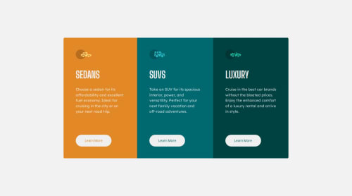
Mobile-first solution using CSS Flexbox.

Please log in to post a comment
Log in with GitHubCommunity feedback
- P@Islandstone89
Hi Nicolas. Here is some feedback.
HTML:
-
The icons are decorative, meaning the alt text should be empty:
alt="". -
"Learn More" would navigate to another page, hence it is not a button but a link.
-
If you include the
<footer>, its text should be wrapped in a<p>.
CSS:
-
It's good practice to include a CSS Reset at the top.
-
Remove
margin,overflowand thepositionproperties on the card container. -
To center the card container horizontally and vertically, use Flexbox on the body:
display: flex; flex-direction: column; justify-content: center; align-items: center; min-height: 100svh;-
Remove all widths and heights in
px. -
Give the card container a
max-widthin rem, so it doesn't get too wide on larger screens. -
font-sizemust never be in px. This is a big accessibility issue, as it prevents the font size from scaling with the user's default setting in the browser. Use rem instead. -
Paragraphs have a default value of
font-weight: 400, so there is no need to declare it. -
Add some
paddingon "Learn More". -
Media queries must be in rem.
Marked as helpful -

Join our Discord community
Join thousands of Frontend Mentor community members taking the challenges, sharing resources, helping each other, and chatting about all things front-end!
Join our Discord