


@MohamedAridah
Posted
Hello @Smritipradhan01, You did a good job for this challenge🎉👏👍.
There are my notes for your project:
- From the first look it was obvious that
box-shadowwas too much. So try reduce it little bit.
.card-container {
	box-shadow: 1px 5px 15px 2px rgb(20 37 61 / 30%);
	/* Always with box-shadow use alpha channel with low opacity */
}
-
use
transitionproperty for.card_attribution spanfor smoother color shifting. -
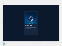
You solution is Responsive and this is good.
HTML Structure
-
instead of the the current html structure. you can use more simple one:
- the card consists of 3 main
<div>s<div>for the card image<div>for the card details<div>for details text<div>for the statistics below it
<div>for the card footer
- the card consists of 3 main
-
you can get rid of
.card_img-overlay-containerand use pseudo elements like::afteror::beforefor the.card-image-container. ex:
.card_img-container::after {
	content: url(./images/icon-view.svg);
	position: absolute;
	background-color: var(--cyan-overlay);
	width: 100%;
	height: 100%;
	opacity: 0;
	top: 0;
	left: 0;
	display: flex;
	align-items: center;
	justify-content: center;
	cursor: pointer;
	border-radius: 1rem;
	overflow: hidden;
	transition: .3s ease;
}
.card_img-container:hover::after {
	opacity: 1;
}
-
instead of using
<hr>element as border between divs you cab useborder-toporborder-bottomproperties depending on the suitable situation. -
you can see My solution for this challenge it may be useful for you.!
I hope this wasn't too long for you, hoping also it was useful😍.
Goodbye and have a nice day.
Keep coding🚀
