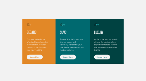
Not Found
Not Found
Not Found
Not Found
Not Found
Not Found
Not Found
Not Found
Not Found
Not Found
Not Found
Not Found
Not Found
Not Found
Not Found
Not Found
Not Found
Not Found
Not Found
Not Found

Submitted

Mobile-first using Flex

Jan 135

@trostjan

Desktop design screenshot for the 3-column preview card component coding challenge

This is a solution for...

  • HTML
  • CSS
1newbie
View challenge

Design comparison


SolutionDesign

Solution retrospective


My second challenge, now really starting to understand how powerful mobile-first approach in combination with using rems and ems can be for quickly building a responsive website. Any feedback is highly appriciated. :)

Community feedback

@tomiwaorimoloye

Posted

Everything looks good but you should set the border radius so the site looks more identical with the design.

Marked as helpful

0

Jan 135

@trostjan

Posted

@ayoelx forgot about that, thanks for the reminder! :)

0
Ayoub1Dev 195

@Ayoub1dev

Posted

When I previewed your site I found a vertical scroll. Using DevTools I found that you did not reset the margin of the body.

  • Like this:
body {
   margin: 0;
}

This will remove the extra space and your wrapper will be 100% of the viewport.

TIP It is a good practice to start with this on your projects, which will set all elements to the styles inside the curly { } brackets.

*, *::before, *::after { 
     box-sizing: border-box;
     margin: 0;
     padding: 0 ;
}

Hope this helps.

Marked as helpful

0

Jan 135

@trostjan

Posted

@Ayoub1dev noted! and corrected :)

0
SM 30

@Sarthakm11

Posted

Hy Jan, Nice work but your "Learn more" buttons are actually not responding to any kind of hover/click, so you can look into that !

0

Please log in to post a comment

Log in with GitHub
Discord logo

Join our Discord community

Join thousands of Frontend Mentor community members taking the challenges, sharing resources, helping each other, and chatting about all things front-end!

Join our Discord