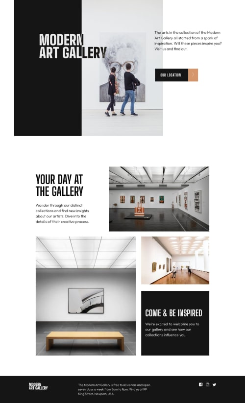
Modern Art Gallery using CSS Grid

Solution retrospective
Hello there,
I am super excited on completing this project. However, when I use the html validator, I get these errors which I don't really understand on how to resolve the issue.
This was the code that I wrote as part of my solution in the html file:
<picture class="grid-3">
        <source media="(min-width: 1200px)"
          srcset="./assets/desktop/image-grid-3@2x.jpg, ./assets/desktop/image-grid-3.jpg">
        <source media="(min-width: 768px)" srcset="./assets/tablet/image-grid-3@2x.jpg, ./assets/tablet/image-grid-3.jpg">
        <source srcset="./assets/mobile/image-grid-3@2x.jpg, ./assets/mobile/image-grid-3.jpg">
        <img src="./assets/mobile/image-grid-3@2x.jpg" alt="" class="w-100">
</picture>
And this error I get when I try to run it in the validator:
Error: Bad value ./assets/desktop/image-grid-3@2x.jpg, ./assets/desktop/image-grid-3.jpg for attribute srcset on element source: Density for image ./assets/desktop/image-grid-3.jpg is identical to density for image ./assets/desktop/image-grid-3@2x.jpg.
Any suggestion to help guide me is greatly appreciated. Thanks
Please log in to post a comment
Log in with GitHubCommunity feedback
- @adityaphasu
Hi!
To address the issue, The
srcsetattribute when provided with a list of images the browser selects the most appropriate one based on the device's characteristics. The error message you got actually indicates that the density (pixel ratio) for the two images you've specified in the srcset attribute is the same.So basically since they have the same pixel ratio the browser won't be able to differentiate between the 2 images.- To fix this issue, you just need to provide pixel density descriptors ( like 1x, 2x ..so on) with the image URLs so that the browser knows which image to display for the high resolution devices and which one for regular ones. You can do it like this:
<picture class="grid-3">
    <source media="(min-width: 1200px)"
        srcset="./assets/desktop/image-grid-3@2x.jpg 2x, ./assets/desktop/image-grid-3.jpg 1x">
    <source media="(min-width: 768px)"
        srcset="./assets/tablet/image-grid-3@2x.jpg 2x, ./assets/tablet/image-grid-3.jpg 1x">
    <source srcset="./assets/mobile/image-grid-3@2x.jpg 2x, ./assets/mobile/image-grid-3.jpg 1x">
    <img src="./assets/mobile/image-grid-3@2x.jpg" alt="" class="w-100">
</picture>
After this, you shouldn't get any errors. (you can see that the images contain that '@2x' so those are actually meant for higher resolution devices hence the 2x for those and 1x for regular ones)
Before fixing this I recommend that you give this a quick read so that you can understand more about it!
By the way nice solution! One tip I could give you is that since you are using sass/scss make different partials for different sections of the page too (like the variables partial). It will be easier to maintain that way.
I hope the error gets fixed!
Good luck and happy coding!🕺🏻

Join our Discord community
Join thousands of Frontend Mentor community members taking the challenges, sharing resources, helping each other, and chatting about all things front-end!
Join our Discord