Submitted about 4 years agoA solution to the Art gallery website challenge
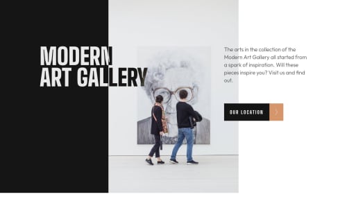
Modern Art Gallery Website using Next.js, TailwindCSS & MapBox
next, react, tailwind-css
LVL 2

@Nafsuki
Solution retrospective
I created this Modern Art Gallery Website using Next.js, TailwindCSS & MapBox.
My Questions:
-On the mobile screen, I wanted to disable the map to zoom, because it bothers when I scroll down the page(it scrolls down the map instead). I read the documentation on mapbox to try to fix that but couldn't really solve the issue. If you have any idea & suggestion, please kindly let me know:))
Any feedback & suggestion for improvement would be very much appreciated ☺️🙏!!
Code
Loading...
Please log in to post a comment
Log in with GitHubCommunity feedback
No feedback yet. Be the first to give feedback on Nafsuki’s solution.
Join our Discord community
Join thousands of Frontend Mentor community members taking the challenges, sharing resources, helping each other, and chatting about all things front-end!
Join our Discord