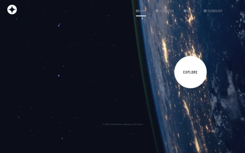
My approach to space website

Solution retrospective
Hi! It's my solution with react, next.js, framer-motion and chakra-ui, I used these tools because I wanted to learn them. Some of my failures:
- /technology : I don't know how to read current width of user window, to manage which image should load, it is loading while changing width of window or refreshing page but it doesn't work at first load
- /destination and /crew: I don't know how to animate changing state
- /crew : Width is chaning while chaning the state, so buttons are not static, and before loading image, is changing width so for a second it look weird, I'm changing width of images so Divider can be still on bottom of picture.
- homePage: Also I don't know how to make hover button as it is on design, so I make my own animated button
If you find more incompatibilities, bad design, ninja code etc... Please comment and point what I'm doing wrong
Please log in to post a comment
Log in with GitHubCommunity feedback
- @TheArkhamKnight781526
-
The width of the window can be found using window.innerWidth. (For my version, I simply loaded in both images and then hid/showed them using CSS media queries.)
-
I don't think animating a change of state is necessary, but a post can be found here about it: https://linguinecode.com/post/how-to-add-react-animation
-
Not entirely sure what you mean.
-
Don't worry, I struggled with that as well! However, the animation you've done unfortunately overlaps with the text sometimes, so I'd consider changing that.
Other notes:
Your mobile menu doesn't have the frosted glass effect in the design.
I would add cursor: pointer to your mobile menu links.
The lilac text colour isn't used on all of the elements it should be, and on the home page it only appears on the mobile design.
There is no background for the navbar.
You should add the same padding/margin to the side of the body as you do to the navbar, because otherwise it looks misaligned and also it doesn't look great when text is just squeezed up against the edge.
On the crew page, when you go to desktop design, the switcher doesn't line up with the text.
On the technology page, you need to add a vertical margin for the switcher so the buttons don't look all squashed up together on desktop.
You might want to consider adding a small bit of padding underneath your mobile menu links, so the border is a little bit spaced out.
There is no hover/active styling for the switcher on the crew page. Also, I would give each switcher button the same margin and not use justify-content to space them, as it gives a weird blowing up/deflating effect when you resize.
The technology images do not span the whole page, unlike in the design.
The text on the home page is not aligned.
The divider on the destination page should be a border of the actual stats component, otherwise the stats go out of the bounds of the divider.
The border is slightly too thick on the navbar, and because of the ::focus outline, you can see that the border and the outline are not the same.
And finally... Well done!!!
Marked as helpful -

Join our Discord community
Join thousands of Frontend Mentor community members taking the challenges, sharing resources, helping each other, and chatting about all things front-end!
Join our Discord