Skip to content
  • Unlock Pro
  • Log in with GitHub
Solution
Submitted over 1 year ago

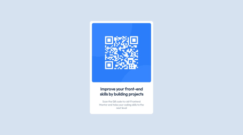
My first attempt at front-end web development - A very basic solution

xirb22•90
@xirb22
A solution to the QR code component challenge
View live sitePreview (opens in new tab)View codeCode (opens in new tab)

Solution retrospective


The style guide for this challenge mentioned a mobile and desktop width (mobile: 375px, desktop: 1440px) but I didn't really know what to do with this information. The mobile and desktop design looked the same so I ended up simply designing the card based on the mobile width. What would be a better way to use this information to create a responsive design?

I also struggled to center the card in the middle of the screen. After some googling I ended up using

body {
      margin: 0;
      position: absolute;
      top: 50%;
      left: 50%;
      transform: translate(-50%, -50%);
}

but this seems like a band-aid solution. Is there a better way to vertically align elements on the page?

Code
Select a file

Please log in to post a comment

Log in with GitHub

Community feedback

  • P
    Daniel 🛸•44,810
    @danielmrz-dev
    Posted over 1 year ago

    Hello @xirb22!

    Your project looks great!

    Using position can be good for projects with just one centered element. But there's a better and more simple way to do it:

    • You can apply this to the body (in order to work properly, you can't use position or margins):
    body {
        min-height: 100vh;
        display: flex;
        justify-content: center;
        align-items: center;
    }
    

    I hope it helps!

    Other than that, great job!

    And Happy New Year 😊

    Marked as helpful
  • Melvin Aguilar 🧑🏻‍💻•61,020
    @MelvinAguilar
    Posted over 1 year ago

    Hello there 👋. Good job on completing the challenge !

    • "mobile: 375px, desktop: 1440px" are just references to the dimensions from which the screenshots are taken; don't confuse them with breakpoints.

    • As mentioned, the solution using flexbox has been suggested, and I'll emphasize that using position: absolute on these elements is not a good idea, as it distorts the component on small screens

    I hope you find it useful! 😄

    Happy coding!

    Marked as helpful
  • alexander•1,300
    @alex931d
    Posted over 1 year ago

    If you set the body 100% width and min-height: 100vh and use display flex and display justifiy-content center and align-items center then inside all elements vil be centered on y-x axles you should be learning flex if ur new to web dev

  • Josh Michael•1,070
    @joshmichael23
    Posted over 1 year ago

    You can use the widths as reference when inspecting the element and changing the width according to the design. That way you can see if your project matches the it. :)

Join our Discord community

Join thousands of Frontend Mentor community members taking the challenges, sharing resources, helping each other, and chatting about all things front-end!

Join our Discord
Frontend Mentor logo

Stay up to datewith new challenges, featured solutions, selected articles, and our latest news

Frontend Mentor

  • Unlock Pro
  • Contact us
  • FAQs
  • Become a partner

Explore

  • Learning paths
  • Challenges
  • Solutions
  • Articles

Community

  • Discord
  • Guidelines

For companies

  • Hire developers
  • Train developers
© Frontend Mentor 2019 - 2025
  • Terms
  • Cookie Policy
  • Privacy Policy
  • License

Oops! 😬

You need to be logged in before you can do that.

Log in with GitHub

Oops! 😬

You need to be logged in before you can do that.

Log in with GitHub

How does the accessibility report work?

When a solution is submitted, we use axe-core to run an automated audit of your code.

This picks out common accessibility issues like not using semantic HTML and not having proper heading hierarchies, among others.

This automated audit is fairly surface level, so we encourage to you review the project and code in more detail with accessibility best practices in mind.

How does the CSS report work?

When a solution is submitted, we use stylelint to run an automated check on the CSS code.

We've added some of our own linting rules based on recommended best practices. These rules are prefixed with frontend-mentor/ which you'll see at the top of each issue in the report.

The report will audit all CSS, SCSS and Less files in your repository.

How does the HTML validation report work?

When a solution is submitted, we use html-validate to run an automated check on the HTML code.

The report picks out common HTML issues such as not using headings within section elements and incorrect nesting of elements, among others.

Note that the report can pick up “invalid” attributes, which some frameworks automatically add to the HTML. These attributes are crucial for how the frameworks function, although they’re technically not valid HTML. As such, some projects can show up with many HTML validation errors, which are benign and are a necessary part of the framework.

How does the JavaScript validation report work?

When a solution is submitted, we use eslint to run an automated check on the JavaScript code.

The report picks out common JavaScript issues such as not using semicolons and using var instead of let or const, among others.

The report will audit all JS and JSX files in your repository. We currently do not support Typescript or other frontend frameworks.

Oops! 😬

You need to be logged in before you can do that.

Log in with GitHub

Oops! 😬

You need to be logged in before you can do that.

Log in with GitHub

Oops! 😬

You need to be logged in before you can do that.

Log in with GitHub

Oops! 😬

You need to be logged in before you can do that.

Log in with GitHub