


@ApplePieGiraffe
Posted
Hello, Raymart Pamplona! 👋
It's nice to see you complete another challenge! 😀 Great job on this one! 🙌 Your solution looks good and responds well and I like the extra toast notification that gets displayed when the user submits an email! 👏
Also, kudos for trying out a mobile-first approach—once you're used to it, it definitely makes things easier at times when it comes to responsive design. 🙂
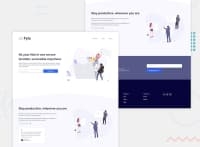
The only thing I might suggest is to add a max-width to some of the sections on the page so that they don't become too wide and so that the content inside them doesn't drift apart a bit on extra-large desktop screens. I usually like to create a wrapper div with a class called something like content-wrapper that I use to wrap the content of all of the sections of a site. It's CSS is usually something simple like, max-width: 1110px; margin: 0 auto. Just a tip! 😉
Also, you might want to give the toast notification a higher z-index since it's gets hidden behind the input element at the top of the page at certain points when you scroll.
Of course, keep coding (and happy coding, too)! 😁
Marked as helpful
@pikapikamart
Posted
@ApplePieGiraffe Thanks APG!! I pushed out the update first before replying^
Yes, that max-width is really necessary here, I always have that in my desktop first workflow but I forgot that here, in my first, mobile first (well, time to go back to desktop workflow, jk).
Also I thought that notification will override things since it is position: fixed but not, hmm.. So really thank you for spotting that one!! Thanks again APG!
@ApplePieGiraffe
Posted
@pikamart
Awesome! 👍 The added max-width does look better, now! 😀 Glad to help! 😊
