Skip to content
  • Unlock Pro
  • Log in with GitHub
Solution
Submitted about 1 year ago

My first solution using media query

Joyce Silva•10
@joycejsm
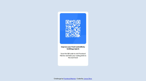
A solution to the QR code component challenge
View live sitePreview (opens in new tab)View codeCode (opens in new tab)

Solution retrospective


What are you most proud of, and what would you do differently next time?

I'm proud of doing this challenge without facing major bugs with simple things as positioning elements the right way, since it was something I had trouble with a while ago.

What challenges did you encounter, and how did you overcome them?

The major challeng was to adapt the div's and image size for mobile screen, without letting it deformed. It was all about which right size use.

What specific areas of your project would you like help with?

Sizes with percent and view width and view height, how and when should I use which one of them.

Code
Select a file

Please log in to post a comment

Log in with GitHub

Community feedback

  • Bernardo Poggioni•6,950
    @R3ygoski
    Posted about 1 year ago

    Olá Joyce, parabéns pela conclusão do seu primeiro desafio aqui no Frontend Mentor.

    Sobre sua duvida de quando usar %, vh e vw, é bem simples. Geralmente você vai utilizar a porcentagem quando você quer que um valor ocupe uma certa porcentagem de um elemento pai, vamos supor que tenhamos o nosso HTML assim:

    <div class="blue">
        <div class="orange">Teste</div>
    </div>
    

    Suponhamos que o .blue tenha 100px de largura, e você quer que o .orange tenha sua largura relativa a de .blue, dessa forma você poderia utilizar a porcentagem, pois assim você estaria falando algo como "O .orange deve ter X por cento do tamanho de .blue".

    Sobre as unidades de viewport, elas são relativas ao tamanho da página na tela. Suponhamos que você está utilizando um celular de 400px de largura, 100vw seria equivalente a 400px, enquanto 90vw seria equivalente a 90% dessa largura total, ou seja 360px. Tanto que geralmente utilizamos essas medidas de viewport para definir o tamanho máximo da página.

    E adicionando um pouco mais a esse comentário abaixo ou acima do meu, que menciona a utilização de rem. É muito mais recomendável utilizar rem ou px para a criação de elementos com tamanhos definidos, por exemplo, esse card do desafio, ele não precisa ter um valor que esteja em constante mudança, então você poderia colocar um width: 310px; por exemplo, que dessa forma ele teria um valor absoluto que não iria alterar baseado no tamanho da tela. Já o rem deve ser utilizado com cautela, isso porque ele é relativo ao tamanho de fonte utilizada pelo navegador do usuário, então se o usuário estiver com uma fonte grande, isso pode deixar o layout da sua página um pouco quebrado, então é recomendável utilizar o rem sempre em todos elementos que você for definir largura e tamanho.

    Edit: Havia esquecido de um ponto bem importante que é relacionado ao alinhamento. Percebi que você utilizou margin para fazer o alinhamento, isso não era necessário, você pode remover esse margin do seu .container e adicionar no seu .qrcode-desktop esse trecho a seguir:

    align-items: center;
    height: 100vh;
    

    Que assim ele fará o alinhamento na vertical.

    E novamente, parabéns, caso tenha ficado qualquer duvida quanto ao que eu disse, por favor, comente abaixo que tentarei ajudar da melhor forma possível.

    Marked as helpful
  • javalzu•420
    @jaalzu
    Posted about 1 year ago

    nice work! i highly recommend you to stop using percents % and start using rems!! percents can make it really hard when u start doing responsive the page. and also i see u don't use the style-guide that give you frontendmentor!!!

Join our Discord community

Join thousands of Frontend Mentor community members taking the challenges, sharing resources, helping each other, and chatting about all things front-end!

Join our Discord
Frontend Mentor logo

Stay up to datewith new challenges, featured solutions, selected articles, and our latest news

Frontend Mentor

  • Unlock Pro
  • Contact us
  • FAQs
  • Become a partner

Explore

  • Learning paths
  • Challenges
  • Solutions
  • Articles

Community

  • Discord
  • Guidelines

For companies

  • Hire developers
  • Train developers
© Frontend Mentor 2019 - 2025
  • Terms
  • Cookie Policy
  • Privacy Policy
  • License

Oops! 😬

You need to be logged in before you can do that.

Log in with GitHub

Oops! 😬

You need to be logged in before you can do that.

Log in with GitHub

How does the accessibility report work?

When a solution is submitted, we use axe-core to run an automated audit of your code.

This picks out common accessibility issues like not using semantic HTML and not having proper heading hierarchies, among others.

This automated audit is fairly surface level, so we encourage to you review the project and code in more detail with accessibility best practices in mind.

How does the CSS report work?

When a solution is submitted, we use stylelint to run an automated check on the CSS code.

We've added some of our own linting rules based on recommended best practices. These rules are prefixed with frontend-mentor/ which you'll see at the top of each issue in the report.

The report will audit all CSS, SCSS and Less files in your repository.

How does the HTML validation report work?

When a solution is submitted, we use html-validate to run an automated check on the HTML code.

The report picks out common HTML issues such as not using headings within section elements and incorrect nesting of elements, among others.

Note that the report can pick up “invalid” attributes, which some frameworks automatically add to the HTML. These attributes are crucial for how the frameworks function, although they’re technically not valid HTML. As such, some projects can show up with many HTML validation errors, which are benign and are a necessary part of the framework.

How does the JavaScript validation report work?

When a solution is submitted, we use eslint to run an automated check on the JavaScript code.

The report picks out common JavaScript issues such as not using semicolons and using var instead of let or const, among others.

The report will audit all JS and JSX files in your repository. We currently do not support Typescript or other frontend frameworks.

Oops! 😬

You need to be logged in before you can do that.

Log in with GitHub

Oops! 😬

You need to be logged in before you can do that.

Log in with GitHub