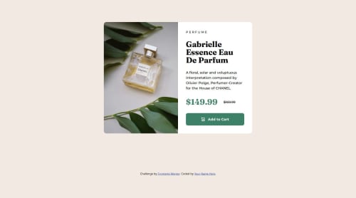
My Product Preview Card Component Solution

Solution retrospective
This time I coded almost without consulting. I think my knowledge about responsiveness is more solid now comparing to the last challenges.
What challenges did you encounter, and how did you overcome them?The challenge was not about coding but the Figma file. I had difficulties on determined the padding and gaps of the elements of the cards. I solved it by doing estimative of these spaces by looking at the design and comparing progressively until both, the design and my solution, look similar.
Also, I was forgetting about how can I change an image depending on the size screen I'm currently on. However, with some searches at Google, I found out I can play with display to show and hide images, so in mobile sizes I hide the desktop image and show the mobile one, and in tablet and desktop sizes I do the opposite.
This is nothing to do code, but I'm curious how programmers can deal with designs with missing details as spaces values. I think that maybe I'm missing something on Figma 😅
Please log in to post a comment
Log in with GitHubCommunity feedback
- @YacoubDweik
Hey Jocelyne!
Nice design actually, you did a great job with the flexbox, I wanted to say that there's no actual need for you to give the whole body display flex in order to align items, you can give the whole container of the design props like position: absolute; top: 50%; left: 50%; transform: translate(-50%, -50%);
- Figma is very very easy to use and You will love it, open the design with Figma, on the left side Panel you would see The mobile or desktop design Just click on what you want then will get the design, zoom in then whenever u click on a white space it gives you how pixels is the padding or margin or even the font size it is amazing! Keep it up!
Marked as helpful

Join our Discord community
Join thousands of Frontend Mentor community members taking the challenges, sharing resources, helping each other, and chatting about all things front-end!
Join our Discord