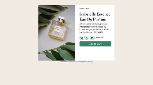
My Product Preview Card made with Bootstrap v5.0

Solution retrospective
This is my first Frontend Mentor challenge and I want to make sure I have followed the challenge instructions correctly. The style-guide says the designs were created to 375px and 1440px respectively for the mobile and desktop versions. Did this mean the width of the document body or the card itself? I assumed it was the body and gave the card a fixed width of 720px for desktop and 375px for mobile. The desktop version was way too big at 1440px wide in my opinion. However, I would make it that big if that was the requirement.
It took me many tries to finally get the code to work the way I wanted it to. I first tried flexbox, then css grid, and ultimately bootstrap was the only way I could get the image and non-image sections to be the same height, although that may be because I finally gave the card a fixed width in both versions. I'm not sure.
Constructive criticism would be appreciated.
Please log in to post a comment
Log in with GitHubCommunity feedback
No feedback yet. Be the first to give feedback on Marta Jo Telkamp's solution.
Join our Discord community
Join thousands of Frontend Mentor community members taking the challenges, sharing resources, helping each other, and chatting about all things front-end!
Join our Discord