Not Found
Not Found
Not Found
Not Found
Not Found
Not Found
Not Found
Not Found
Not Found
Not Found
Not Found
Not Found
Not Found
Not Found
Not Found
Not Found
Not Found
Not Found
Not Found
Not Found

Submitted

my second challenge using HTML and CSS only.

@Polariz626

Desktop design screenshot for the 3-column preview card component coding challenge

This is a solution for...

  • HTML
  • CSS
1newbie
View challenge

Design comparison


SolutionDesign

Solution retrospective


Hello, Braian again. these challenges are a perfect way to practice all the theory we learn from some courses on the internet. I'm very satisfy with how this turned out, but as always I had some problems making this page responsive enough :(. When I shrink the page, the three containers and the buttons behave weirdly :/. Any suggestion would be highly appreciated.

Community feedback

@rngueco

Posted

Hey Braian!

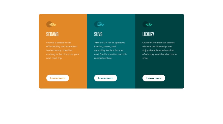
I think the reason why the containers behave weirdly when shrinking the page is because there is barely enough room for the content (for example, when my viewport is at 700px wide, the buttons start to get squeezed and it wraps into two lines instead of one).

One solution could be to make your container wider as the screen width goes smaller for the desktop view. And if you don't want your text to wrap, you could add white-space: nowrap to that text element (this could potentially make the text overflow the container though, but use it as you see fit).

Happy coding! 🎉

0

Please log in to post a comment

Log in with GitHub
Discord logo

Join our Discord community

Join thousands of Frontend Mentor community members taking the challenges, sharing resources, helping each other, and chatting about all things front-end!

Join our Discord