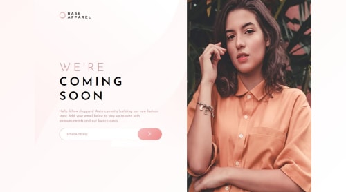
My version of base apparel comming soon page challenge.

Solution retrospective
I’m proud to have completed this challenge. Even when I’m unsure how to do something, I always find a way. I know this is a small project, but it’s a step toward taking on bigger and tougher ones.
What challenges did you encounter, and how did you overcome them?I’m still working on getting better at responsive design and JS interactions.
What specific areas of your project would you like help with?Responsive design and JavaScript. I’m open to any feedback that can help me improve my skills.
Please log in to post a comment
Log in with GitHubCommunity feedback
- @thisisharsh7
Great job completing the challenge! Here’s feedback to enhance your project:
HTML/CSS: The structure is clean, and the use of CSS custom properties for colors/gradients is excellent. However, the responsive design can be improved. The
.hero__containerwidth transitions (80% to 100%) feel abrupt; consider smoother scaling withmax-width. The mobile layout works, but the.hero__mainfixed width (300px) may cause overflow on smaller screens—use relative units likevworminmax. The.hero__errorpositioning could be more robust usingright: calc(100px + 10px)to align with the button.JavaScript: The email validation logic (
inputEmail.value.includes('@' && '.')) is flawed due to incorrect operator precedence. UseinputEmail.value.includes('@') && inputEmail.value.includes('.')for proper validation. Consider adding a regex for more robust email checking (e.g.,/^\S+@\S+\.\S+$/). Also, the button lacks a click event to handle form submission—add one to validate on submit.General: Test across more devices to ensure no overflow. Keep practicing responsive design and JS validation.
Awesome work—focus on refining these areas for even stronger projects!
Marked as helpful

Join our Discord community
Join thousands of Frontend Mentor community members taking the challenges, sharing resources, helping each other, and chatting about all things front-end!
Join our Discord