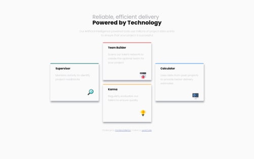
my-four-card-feature-section-challenge-solution

Please log in to post a comment
Log in with GitHubCommunity feedback
- @grace-snow
Hi
There is loads on here that doesn't need to be on here. If you worked mobile first, your code would be a lot shorter. You also have a lot of duplication across each card. They have loads of shared styles so can have one class that does all of that. Then they each need one extra class, or you can use a selector like nth child to target each one and override the border color, and then the grid position on desktop.
Here is what I just changed in browser. Most of it was commenting out unnecessary duplication in media queries
/* main.css | https://usancode.github.io/four-card-feature-section-master/four-card-feature-section-master/main.css */ .grid-container { /* width: 58rem; */ /* height: 30rem; */ /* padding-top: 2%; */ /* padding-bottom: 2%; */ max-width: 58rem; } @media screen and (max-width: 820px) { .grid-container { /* width: 52rem; */ /* height: 30rem; */ /* display: grid; */ /* grid-template-rows: 1fr 1fr 1fr 1fr; */ /* grid-template-columns: 1fr 1fr 1fr 1fr 1fr 1fr; */ /* row-gap: 1.5rem; */ /* column-gap: 1.5rem; */ /* margin: auto; */ /* padding-top: 2%; */ /* padding-bottom: 2%; */ /* justify-content: center; */ grid-template-columns: auto; } body { /* background-color: hsl(0, 0%, 98%); */ /* margin-right: 4%; */ /* margin-left: 3%; */ /* margin-top: 5%; */ /* margin-bottom: 5%; */ /* max-width: 1440px; */ /* width: 100%; */ /* justify-content: center; */ } } body { /* margin-right: auto; */ /* margin-left: auto; */ /* max-width: 1440px; */ /* width: 100%; */ /* justify-content: center; */ margin: 0; padding: 1rem; } .heading { /* line-height: 0.4rem; */ /* text-align: justify; */ /* text-justify: distribute-all-lines; */ /* justify-items: center; */ /* margin: auto; */ /* padding-bottom: 0.5rem; */ /* grid-column-start: 1; */ /* grid-column-end: 2; */ /* grid-row-start: 1; */ /* grid-row-end: 2; */ line-height: 1.3; note: line height should be unitless; } .mainBlock { /* display: grid; */ /* grid-template-columns: 100%; */ /* grid-template-rows: 30% 30%; */ note: why all these divs?; margin-bottom: 1rem; } .mainContainer { /* width: 75%; */ /* margin: auto; */ /* justify-content: center; */ margin: 0 auto 2rem auto; text-align: center; } .motto { /* width: 50%; */ max-width: 50ch; } @media screen and (max-width: 540px) { .mainBlock { /* display: grid; */ /* grid-template-columns: 100%; */ /* grid-template-rows: 30% 30%; */ } .mainContainer { /* width: 100%; */ /* margin: auto; */ /* justify-content: center; */ } .heading { /* line-height: 0.4rem; */ /* text-align: justify; */ /* text-justify: distribute-all-lines; */ /* justify-items: center; */ /* margin: auto; */ /* padding-bottom: 0.5rem; */ /* grid-column-start: 1; */ /* grid-column-end: 2; */ /* grid-row-start: 1; */ /* grid-row-end: 2; */ } .motto { /* text-align: justify; */ /* justify-items: center; */ /* width: 15rem; */ /* height: 3rem; */ /* margin: auto; */ /* padding-bottom: 0.3rem; */ /* font-size: 14px; */ } .grid-container { /* display: grid; */ /* grid-template-columns: 16rem; */ /* grid-template-rows: 13rem 13rem 13rem 13rem; */ /* width: 20rem; */ /* height: 56rem; */ /* row-gap: 1rem; */ /* justify-content: center; */ /* margin: auto; */ /* padding-top: 2%; */ /* padding-bottom: 2%; */ } .firstBlock { /* border-top-style: outset; */ /* border-top-color: hsl(180, 62%, 55%); */ /* background-color: hsl(0, 0%, 98%); */ /* border-radius: 0.2rem; */ /* box-shadow: 0.1rem 0.5rem 0.5rem hsl(229, 6%, 66%); */ /* padding-bottom: 1rem; */ /* padding-left: 2rem; */ /* padding-right: 2rem; */ } .secondBlock { /* border-top-style: outset; */ /* border-top-color: hsl(0, 78%, 62%); */ /* background-color: hsl(0, 0%, 98%); */ /* border-radius: 0.2rem; */ /* box-shadow: 0.1rem 0.5rem 0.5rem hsl(229, 6%, 66%); */ /* padding-bottom: 1rem; */ /* padding-left: 2rem; */ /* padding-right: 2rem; */ } body { /* width: 100%; */ /* background-color: hsl(0, 0%, 98%); */ /* justify-content: center; */ } } // Usually a css reset at the start will remove browser styles like margin on headings h1, h2 { margin: 0; }Marked as helpful - @grace-snow
This doesn't look like the design yet, it doesn't look finished. Don't rush through lots of challenges without pausing to reflect, refator and learn
It's also really important that you Indent your code consistently. Your code editor can even format everything for you.
Also important for headings to be correctly structured and in the right order. You can't skip heading levels
Slow down
Marked as helpful

Join our Discord community
Join thousands of Frontend Mentor community members taking the challenges, sharing resources, helping each other, and chatting about all things front-end!
Join our Discord