Nested Grids and Flexbox

Solution retrospective
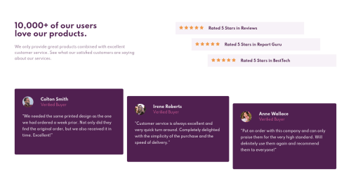
I got in trouble getting the sizing of the nested grids right (specially the testimonials section). Any help would be greatly appreciated!
Please log in to post a comment
Log in with GitHubCommunity feedback
- @pikapikamart
Hey, great work on this one. The desktop layout looks fine, though the
h1is small, the text below it is not using a left-alignment and maybe adding morepaddingto thebodyor in a container so that the content won't look like spaced out. The site responds but if you go to at 500px upwards, you will see that the content is being hidden by the screen and creates horizontal scrollbar.Here are some other suggestions for the site:
- Avoid using
height: 100%orheight: 100vhon a large container like thebodyas this makes the element's height capped based on the viewport/screen's height. Instead usemin-height: 100vhso that the element will expand if it needs to. - The
font-weight: 700on theh1could be remove since by default it already uses this. - For the
.reviewsselector, you don't really need to usegridon that one since the it's direct child is already a block element that will wrap on its own row. You just need to usemarginon those item to place them properly like on the design. - For each
.review, usingarticleon them is not the best choice since anarticletag usually contains content that is independent and could be redistributed on another page since it can sit on its own. For this one, you could just usedivon each. - Each of the star icons, you can just use the image path as the value for the
backgroundproperty of each.reviewselector. Remember thatbackgroundcan contain multiple image, this way you won't have to create multipleimgtags. - Though, if you insist on using
imgtags for the star-icons, then make sure to addalt=""andaria-hidden="true"so that screen-reader will skipped that image since it is only a decorative image. - For each person's
imgtag, it would make sense to use their full name as thealtvalue since it is already present. - Also, for each testimonial, you could use this markup below so that it will be easy for screen-reader to traverse it using
blockquote:
<figure>
 <img src="" alt={person name}>
 <blockquote>
   <p> {qoute in here}</p>
 </blockquote>
 <figcaption>
   person name
   <p>
     person role
   </p>
 </figcaption>
</figure>
Though you just need to use
gridon thefigureto place each item properly since afigcaptionshould be the first or last item of afigureelement.- The
verified-buyershould not be using a heading tag since it doesn't really give information on what a section/part of the layout would contain. Aptag on it would be nice. - Lastly, addressing the responsiveness issue on the site:>
Aside from those, great job again on this one.
Marked as helpful - Avoid using
- @rlabuonora
Hi! Thanks a lot for your feedback. I recoded the layout to solve some of the problems you pointed out.
I focused mainly on the layout because I'm trying to learn that, so I didn't implement the semantic html suggestions. I'll probably revisit it in a few days for those.
Thanks again!

Join our Discord community
Join thousands of Frontend Mentor community members taking the challenges, sharing resources, helping each other, and chatting about all things front-end!
Join our Discord