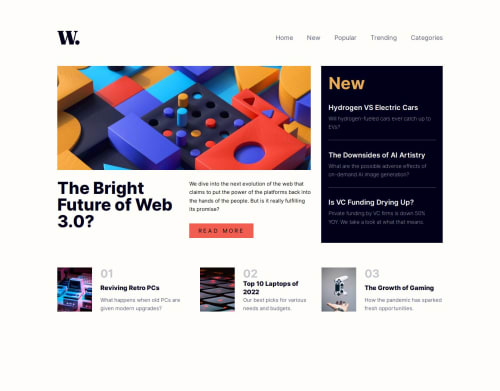
Submitted over 1 year agoA solution to the News homepage challenge
New Homepage - Mobile first, SASS/SCSS, Flexbox, Grid
sass/scss

@MiyaoCat
Solution retrospective
What challenges did you encounter, and how did you overcome them?
I had trouble getting the menu pop-out to work properly. I initially used 'position absolute', but I learned about 'inset' after looking at another user's solution. When I did 'position: absolute', the menu would remain in place when I changed the width of the screen (as expected I suppose). Using 'inset' was much more efficient and I could set the menu to only take up a percentage of the screen width.
Code
Loading...
Please log in to post a comment
Log in with GitHubCommunity feedback
No feedback yet. Be the first to give feedback on John's solution.
Join our Discord community
Join thousands of Frontend Mentor community members taking the challenges, sharing resources, helping each other, and chatting about all things front-end!
Join our Discord