


@OneBitMance
Posted
Hello there!
Your solution for the project is interesting and it's a good idea, but it could definitely use more work.
The first flaw I noticed was that you tried to make headers as active-states by adding the 'href' attribute to your h4 and h5 tags which doesn't work with them. I would've nested anchor ( <a> ) tags inside your h tags and styled them instead.
e.g.
<h4><a href="#">Hydrogen VS Electric Cars</a></h4>
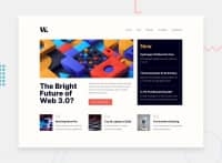
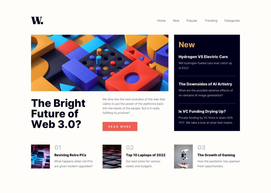
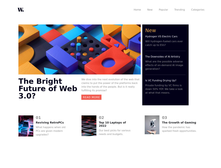
Second flaw I have noticed is that the images in your row container at the bottom of the page start to look squashed as the screen width decreases and at around 570px they get sorted out and start to look nice for lower mobile-screen widths.
This should represent a problem for people who use resolutions that have low widths ( e.g. an 800x600 resolution ) as the content for them would appear squashed.
And as for your pages main content, the image always stays as the desktop image, it doesn't change to the mobile version as width gets lower.
The part I liked the most about your solution was the Navigation Bar and the Mobile Menu which looked super clean and worked like a charm!
Overall a great take on the project, without the visual flaws I think this project would be a bullseye! I am very proud of the awesome work you put in!
