Not Found
Not Found
Not Found
Not Found
Not Found
Not Found
Not Found
Not Found
Not Found
Not Found
Not Found
Not Found
Not Found
Not Found
Not Found
Not Found
Not Found
Not Found
Not Found
Not Found

Submitted

CSS Grid, Without JS and mobile nav functionality

Amer 360

@amerrika

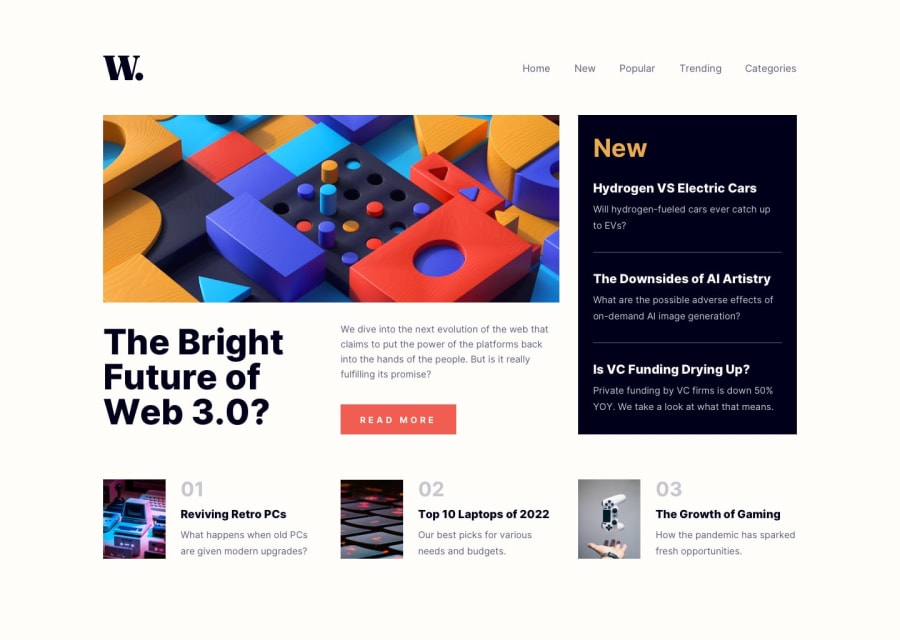
Desktop design screenshot for the News homepage coding challenge

This is a solution for...

  • HTML
  • CSS
  • JS
2junior
View challenge

Design comparison


SolutionDesign

Solution retrospective


Hello everyone! After watching Kevin Powell's tutorial on grid I wanted to do this project to practice it. I am fairly happy with how the layout turned out but I am not happy at all with my Bottom Articles (3 articles that should be the same). They have weird behavior, images do not have the same size and at smaller screens I don't have bottom-padding of the body. Happy to hear your suggestions

Community feedback

@SinisaVukmirovic

Posted

Hello!

Difference in the amount of text in your 3 bottom articles is what is causing the images to all have different sizes. Remove some of the text to see the change.

You need to refactor your code. You either have to have a set width for the image, for example 33% and text area at 67%. Or even better, to go with the CSS Grid instead of the Flex-Box.

Hope this helps to turn you in the right direction towards fixing your code.

Marked as helpful
0

Please log in to post a comment

Log in with GitHub
Discord logo

Join our Discord community

Join thousands of Frontend Mentor community members taking the challenges, sharing resources, helping each other, and chatting about all things front-end!

Join our Discord