News Homepage Solution

Solution retrospective
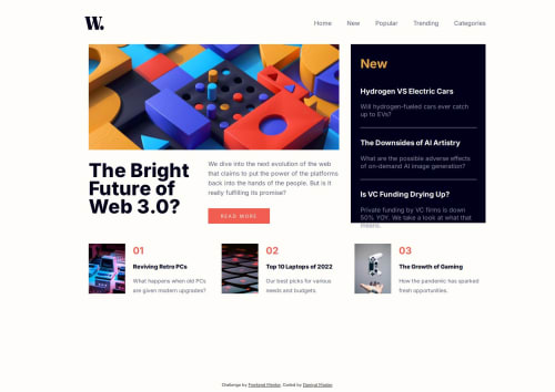
I started by creating all the HTML elements and assigning them classes. Next, I began working on the header, where I styled links, hover effects, and the logo, I used properties such as display flex, and gap to achieve the design I was looking for. Next, I moved onto the top pick section, where I added some basic CSS to style the text, and images. I used the margin and gap properties to separate each card, to achieve the design I wanted. Then, I began working on the top picks section. I styled the headers, hover, hr's, and subtext. I added some padding, and the appropriate colors. I spent some time styling the header text using properties such as letter spacing and line height to get the design right. I once again used basic CSS to style the button, subtext, and image. Now, I began working on the grid. I used grid template columns, and the visual cues from my browser dev tools, to get my layout right. For the JS, I used basic Javascript DOM manipulation to get the design and elements working the way I wanted, and learned about a way to control what is shown based on the width of the window using Javascript. Once I finished, I tested the website on multiple browsers, added some responsive design using media queries, and used the built-in device size emulation feature to view what the website would look like on different devices.
Please log in to post a comment
Log in with GitHubCommunity feedback
No feedback yet. Be the first to give feedback on Daniyal Master's solution.
Join our Discord community
Join thousands of Frontend Mentor community members taking the challenges, sharing resources, helping each other, and chatting about all things front-end!
Join our Discord