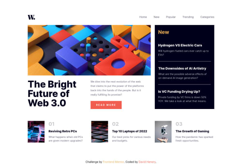
News-Homepage (Responsive, CSS-Grid, Flexbox, Tailwind CSS)

Solution retrospective
This is the second project I have built with Tailwind CSS, Which had a bit more moving parts to make responsive, but it was fun learning and using more Tailwind.
Any type of feedback would be massively helpful, Thank You!
Please log in to post a comment
Log in with GitHubCommunity feedback
- @AdrianoEscarabote
Hi David, how are you? I really liked the result of your project, but I have some tips that I think you will enjoy:
If we see how the layout is behaving at higher resolutions, with the help of google dev tools, we will see that it is stretching a lot, to solve this we can use a max-width with the value we want the content to stop growing and to center use a margin: 0 auto;
body {
    max-width: 1440px;
    margin: 0 auto;
}
I noticed that you used a
buttonin which case the best option would be ana, because in my head when a person clicks on a button written Read more, he is not confirming a form, or something like, it will be redirected to another page, to read more about!To resolve do this:
<a class="h-12 w-46 bg-softRed text-sm font-bold tracking-btn text-offWhite hover:bg-veryDarkBlue">READ MORE</a>The rest is great!
I hope it helps... 👍
Marked as helpful - Account deleted
Hi; add the property 'object-fit: content' to the images to avoid it distorted when resize

Join our Discord community
Join thousands of Frontend Mentor community members taking the challenges, sharing resources, helping each other, and chatting about all things front-end!
Join our Discord