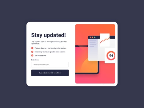
Newsletter Signup by Sham

Solution retrospective
Please take a moment to review the component I have created using HTML, CSS, JavaScript, and Animate.css. I would greatly appreciate it if you could rate it on a scale of 1 to 10 and provide any feedback you may have for future enhancements.
Please log in to post a comment
Log in with GitHubCommunity feedback
- @itush
Congratulations on completing the challenge! 🎉
Your solution looks very beautiful :)
My rating: 8/10
In my projects:
- I always start with mobile-first workflow.
- I use at least one main element for a page (entire content goes into the main, if I'm not using header & footer), and avoid divs as much as possible and use section and article element wherever I can.
<body> <main> All content </main> </body>-
I Use relative units as much as possible and avoid absolute units whenever possible.
-
If you are someone who is just starting out with front-end development, I strongly suggest starting with the QR code component project. Also in the challenges page you may filter by (Newbie, HTML&CSS) sort by (easier first) to select projects that will help you solidify your foundation. To avoid any potential knowledge gap⚠️ please first solidify HTML, CSS, JS fundamentals, make few projects only with the trio and then move on to any framework or library.
-
I remember when I started out, I made countless mistakes and spent long hours searching for solutions. But hey, you don't need to go through the same struggles! 🙌 To help you shorten the learning curve, I recommend going through the following articles. They contain valuable insights that can make your journey smoother:
📚🔍 12 important CSS topics where I discuss about css position, z-index, box-model, flexbox, grid, media queries, mobile-first workflow, best practices etc. in a simple way.
📚🔍 11 important HTML topics where I discuss about my thought process and approach to convert a design/mock-up to HTML along with important topics like block and inline elements, HTML Semantic Elements.
I hope you find these resources somewhat helpful in your coding adventures! 🤞
I'm eagerly looking forward to seeing the amazing projects you'll create in the future! 🚀💻
Keep up the fantastic work and happy hacking! 💪✨
Marked as helpful - @Rhinozer0s
Hey, i also have some suggestions for improvement for you.🙃
Espacially for responsive images, there is the
<picture>element. The code for it could look like this:<picture> <source media="(min-width:40em)" srcset="image-desktop"> // media query <img src="image-mobile"> // fall-back image </picture>You can read more about the picture-tag here
What has always bothered me a lot is the little white border under the image. You can fix this by assigning the
display: block;property to the image.i hope you find this helpful mate 🤝
Marked as helpful - @moonrose93
looking cool ! but I need some help heere. why when I upoad the file via github in the netlify platform the svgs are not shown in the preview? Im new in this so pls some tip, do I need to convert the svg files into HTML code? hmm


Join our Discord community
Join thousands of Frontend Mentor community members taking the challenges, sharing resources, helping each other, and chatting about all things front-end!
Join our Discord