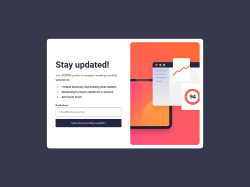
Newsletter sign-up using html, scss, js, gulp

Solution retrospective
In success state on mobile devices I used flexbox with flex direction on column.Next I used align-self: flex-end to button to set it on the bottom of the main container. However it didn't work for me. I wonder what I did wrong that it didn't work as I expected to work. I would be grateful for any suggestions.
Please log in to post a comment
Log in with GitHubCommunity feedback
- @HayyatHussain
When you set flex-direction to column, the main-axis and the cross-axis are both swapped, as compared to the default flex-direction: row. The horizontal-axis becomes the vertical-axis. Therefore, justify-content now holds the container in the vertical-axis or y-axis, and align-items/align-self hold it in the horizontal axis. Therefore you can't use align-self set to flex-end, as it now controls the container in the x-axis.
In short, if we change our flex-direction to column, align-items and align-self will align the items to the left and right.

Join our Discord community
Join thousands of Frontend Mentor community members taking the challenges, sharing resources, helping each other, and chatting about all things front-end!
Join our Discord