


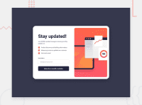
Design comparison


Solution retrospective
Hello!
I chose this challenge to start playing with JavaScript as well as test my skills with basic form structure, validation, and submission. Poping modal with message was great oportunity to work with DOM manipulation. I tried to make the entire component accessible. The biggest challenge was to create an accessible form validation with poping error message as well as an accessible modal dialog for success message.
Here's some things I used or learned:
- Implemented CSS
backdrop-filterproperty for overlay when the modal pops up. The backdrop-filter property is used to apply a graphical effect to the area behind an element. I used it to blur the page behind my overlay. - Tried to make accessible form validation aswell as accessible modal dialog by using appropriate attributes and structure either on my form or modal.
- Used
<picture>HTML element for responsive images. That is images that work well on devices with widely differing screen size. HTML provides us with elements to display identical image content, just larger or smaller depending on the device. This helps to improve performance across different devices. - Reduced browser inconsistencies in things like default line heights, margins and font sizes of headings, and so on by using CSS Reset by Andy Bell
- Arranged my code with BEM - Block, Element, Modifier methodology, which is a popular naming convention for classes in HTML and CSS. BEM is useful when it comes to larger, more complex projects when code organization becomes crucial. The idea behind it is to speed up the development process, and ease the teamwork of developers by arranging CSS classes into independent modules.
- I went down the road with mobile-first approach. It is one of the best strategies to create either a responsive or adaptive design. Started with the smallest mobile screen and worked my way up.
- Used
:focus-visiblepseudo-class to increase usability for sighted users who use keyboard navigation. The :focus-visible pseudo-class is a native CSS way to style elements that are in focus but only applies when you actually want a visual indicator to help the user see where the focus is. - Instead of repeating code for reusable elements I write some helper classes to reuse them throughout the project. I created reusable classes for headings, paragraphs or containers. This saves time as well as unnecessary code repetition. I will definitely try to improve in this aspect.
Questions:
- No specific question but any input on form accesibility aswell as modal accessibility would be welcome.
Any suggestions on how I can improve are welcome!
Community feedback
Please log in to post a comment
Log in with GitHub
Join our Discord community
Join thousands of Frontend Mentor community members taking the challenges, sharing resources, helping each other, and chatting about all things front-end!
Join our Discord