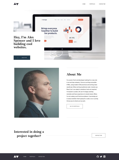
Next.js, Tailwind CSS , Typescript - Minimal Portfolio Site

Solution retrospective
I have listed the areas of the project where I have been learning and could use some feedback. You should be able to find excerpts of these sections outlined in the README.md file of my project directory to save you time if you want to check it out.
-
I used the Tailwind CSS
@applydirective to create utility classes that i used through out the tailwind project so i could avoid writing the same styles over and over. I know this is not the best method but it was pretty simple to get up and running in my first project with tailwind. i read this article and plan to use a combination of method 2 which uses react components to extract reused tailwind styles and the custom utility class method to style my next project. If you have any thoughts on the best practice for extracting tailwind classes i am interested in your view. -
I have been reading about the Next.js Image optimization component and see that it does a lot to optimize photos in your application. In this project we are given optimized images. If I use the Image component from Next.js I have difficulties in finding a way to set the display to none and switch to the tablet sized image for example. Has anyone found a way to make use of the Next.js Image component while building project with pre-optimized images or should I continue to use the
<img>tag in these cases?
Thanks for reading!
Please log in to post a comment
Log in with GitHubCommunity feedback
No feedback yet. Be the first to give feedback on Joey Desjardin’s solution.
Join our Discord community
Join thousands of Frontend Mentor community members taking the challenges, sharing resources, helping each other, and chatting about all things front-end!
Join our Discord