


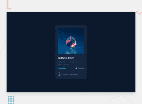


This looks good, though I'd be tempted to add a little padding so the card doesn't quite touch the sides of the screen on small widths. Or let it touch the sides but remove the border-radius in that case.
A note here about semantic tags.
Interactive elements must be either buttons (if they do something like submit a form) or anchors (if they are a link for navigation). Whenever you see a hover-effect in a design, that implies it is an interactive element.
So here, the image and the heading and the username must all be wrapped in interactive elements. Those will then get :hover and :focus or :focus-visible styles in the css.
Thinking about this further still. The design doesn't specify whether these should be buttons or anchors. But if we imagine a real card. Probably when we click on the title we would go to a detail page. And when we click on a username then we'd go to that user's profile. So those should both be in anchor tags. When we click on the image, we might expect a bigger version of the image to open in a lightbox overlay. In which case it should be a button. Or it might navigate to a full page with a large image, in which case it should be an anchor. You can decide which makes most sense there.
Marked as helpful
@fdsantos300
Posted
@AlexKMarshall Hey, thank you for taking your time and check my work, helped me to understand better CSS. I'll try to improve all mentioned points as you suggested.
Cheers!


