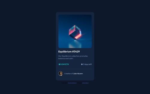
Submitted over 3 years agoA solution to the NFT preview card component challenge
NFT Card with CSS (flexbox)

@AdamElitzur
Solution retrospective
Is there anything I should be doing differently? I use flexbox a lot, is there a better way I should be centering things? (Like the eye icon when you hover over the image, and the price and ETH icon and time and clock icon) Thanks!
Code
Loading...
Please log in to post a comment
Log in with GitHubCommunity feedback
No feedback yet. Be the first to give feedback on Adam Elitzur's solution.
Join our Discord community
Join thousands of Frontend Mentor community members taking the challenges, sharing resources, helping each other, and chatting about all things front-end!
Join our Discord