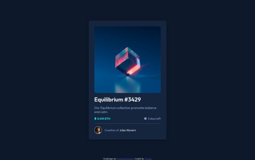
NFT card with hover effect

Solution retrospective
Please Give your feedback and let me know where I can improve myself.
Please log in to post a comment
Log in with GitHubCommunity feedback
- P@visualdenniss
Hello Tinker :)
Nice job completing the challenge successfully! Suggestions:
- It looks like the span texts are broken into two lines, but in the design they are all in the same line. A quick fix would be using this: white-space: nowrap; for .num-class .eth, .days (i showed this example to make you aware of this property)
but there is even a better way, just use align-items: center;
- .num-class .eth, .days { display: flex; align-items: center; }
Why better than white-space in this case? Cuz if you notice, while it solves line break, the icons seem to be stretched in height a bit, this is because flexbox by default stretches it. align-items: center; not only fixes the line break but also fixes the stretching of the icons.
And no, adding gap: 5px as suggested, won't fix it because that is not the issue.
- Bonus TIP: You can add a transition like transition: all .4s ease; to .equil-img make the overlay appear smoothly.
Hope you find this feedback helpful!
Marked as helpful - @0xabdulkhaliq
Hello there 👋. Congratulations on successfully completing the challenge! 🎉
- I have other recommendations regarding your code that I believe will be of great interest to you.
CSS 🎨:
- Looks like the component needs a bit of
paddingso add some padding to themainelement.
- And, the items inside
.eth&.daysare need to placed side by side but here they are stacked upon each other. We can fix it by following snippet.
.eth, .days {
    display: flex;
    gap: 5px;
}
.
I hope you find this helpful 😄 Above all, the solution you submitted is great !
Happy coding!
Marked as helpful


Join our Discord community
Join thousands of Frontend Mentor community members taking the challenges, sharing resources, helping each other, and chatting about all things front-end!
Join our Discord