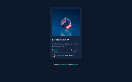
NFT Card with Less CSS

Solution retrospective
Give me Feedback, Feel Free !
Please log in to post a comment
Log in with GitHubCommunity feedback
- @Salah1221
Hi Rian, You did a great job in your solution, but I noticed some improvements that can be made:
- You can remove the annoying space below the image by adding
display: block;to.cypto. - Add
white-space: nowrap;to theh2headings of.timeand.priceto keep them on the same line. - Add
position: absolute;to.attributionto remove it from the document normal flow so it can be positioned easily with respect to the body without interfering with the card. - Center the card in the
bodyusing flexbox, before doing that the body should have the full height of the view port (giveheight: 100vh;to the body). - After centering the card you can remove the
margin,margin-top, andmargin-bottomproperties from the.containerdiv so the card would be perfectly centered. And that's it! Happy coding!
- You can remove the annoying space below the image by adding
Join our Discord community
Join thousands of Frontend Mentor community members taking the challenges, sharing resources, helping each other, and chatting about all things front-end!
Join our Discord