


Kawsar Ahmed Fahad• 2,680
@faha1999
Posted
Hello, khaleelulah Congratulations on finishing this project. It's lovely and great on the whole! Just a little tip:
- You might want to use semantic tags like the
<main>to wrap your code, instead ofdiv. like
<main class="main-container">
</main>
This would help improve accessibility.
- active-state of
img
<a class="image" href="#">
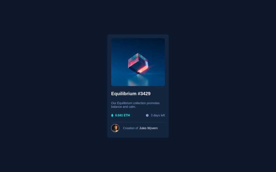
<img src="./assets/images/image-equilibrium.jpg" alt="Equilibrium image" />
</a>
- hover effect
.image {
	position: relative;
	display: block;
	height: 320px;
	overflow: hidden;
	border-radius: .7rem;
}

.image::before {
	content: '';
	position: absolute;
	top: 0;
	left: 0;
	z-index: 100;
	width: 100%;
	height: 100%;
	opacity: 0;
	transform: scale(0);
	background-color: transparentize(hsl(178, 100%, 50%), 0.5);
	transition: transform 0.4s ease-in-out, opacity 0.3s;
}

.image:hover::before {
	opacity: 1;
	transform: scale(1);
}

.image::after {
	content: url(../../images/icon-view.svg);
	position: absolute;
	top: 0;
	left: 0;
	z-index: 100;
	width: 100%;
	height: 100%;
	opacity: 0;
	transition: opacity 0.2s ease-in 0.1s;
	display: flex;
	justify-content: center;
	align-items: center;
}

.image:hover::after {
	opacity: 1;
}
- for HTML validation error of
imgplease visit below links
https://developer.mozilla.org/en-US/docs/Web/HTML/Element/img,
https://www.w3schools.com/tags/att_img_width.asp
-
fix the other Accessibility issue from the report.
-
Instead of using
px, use relative units likerem or emto get better performance when the information on your page needs to be resized for multiple screens and devices.REMandEMapply to all sizes, not justfont-size. You can code your entire page inpxand then, at the very end, use the VsCode pluginpx to remto perform the automatic conversion px to rem
I hope it will work. Happy coding.
Marked as helpful
0
