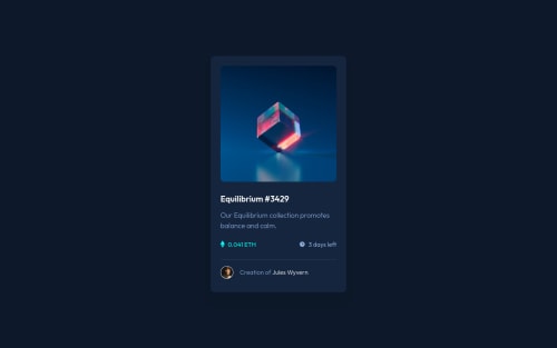
Not Found
Not Found
Not Found
Not Found
Not Found
Not Found
Not Found
Not Found
Not Found
Not Found
Not Found
Not Found
Not Found
Not Found
Not Found
Not Found
Not Found
Not Found
Not Found
Not Found

Submitted

NFT Preview Card

Jordan 180

@GitNutts

Desktop design screenshot for the NFT preview card component coding challenge

This is a solution for...

  • HTML
  • CSS
1newbie
View challenge

Design comparison


SolutionDesign

Solution retrospective


Can somebody explain how adding two box-shadows like I have creates that effect and how it's actually working? I understand the basics but I got the idea from somebody else.

Also, is there a better/easier way to create the overlay or is my method good enough?

Thanks

Community feedback

@Draghonite

Posted

Your solution is near pixel-picture, nice work; unlike mine, it's response on mobile.

I find that there's a weird jitter effect in the overlay due to the transition; my preference would be to get rid of the transition on the overlay, but keep it on the "eye"-con.

As to how the box-shadow properties work, that's quite the read: https://developer.mozilla.org/en-US/docs/Web/CSS/box-shadow.

Marked as helpful

1

Jordan 180

@GitNutts

Posted

@Draghonite Thanks. I don't think removing the transition on the overlay makes any difference. The jitter effect is because when you hover over the "eye" there is no overlay and I don't think there's a way to change that due to z-index?

0
Edgar 220

@edgarbp95

Posted

/* offset-x | offset-y | blur-radius | spread-radius | color */

try to give a blur-radius and spread-radius. Some like that: box-shadow: 0 25px 50px 15px #0c1729;

it works to me. I hope to be helpful.

0

Please log in to post a comment

Log in with GitHub
Discord logo

Join our Discord community

Join thousands of Frontend Mentor community members taking the challenges, sharing resources, helping each other, and chatting about all things front-end!

Join our Discord