Submitted over 3 years agoA solution to the NFT preview card component challenge
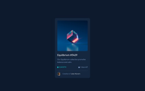
NFT preview card component

@Hamza-Noah
Code
Please log in to post a comment
Log in with GitHubCommunity feedback
- @anoshaahmed
To get rid of the accessibility/HTML issues shown in your Report:
- wrap everything in your body in
<main>OR use semantic tags OR giverole=""to the direct children of your<body>... Click here to read more - have at least one
<h1>in your code
Good job! :)
Marked as helpful - wrap everything in your body in
- @grace-snow
Damn I just wrote loads of feedback on css too then lost it 😭
Oh well I'll try to summarise but it will be briefer...
- use min-height 100vh not height
- use max-width on the card not width
- theres no need for the eye image to be in css when you are already using a pseudo element for the image hover effect. You can place that image in the pseudo as a background-image and get rid of the transform-translate stuff to center it as background images are positioned centrally by default anyway
- stop nesting css selectors. I can't stress how important this is. Ykh will have nightmares on larger projects writing css like this. Use single class selectors as much as possible, keep your css specificity low
- add padding to body or margin to card to keep the component from hitting screen edges on mobile
Sorry for the rush - I hope that helps anyway. Good luck
Marked as helpful - @grace-snow
This doesn't look finished yet I'm afraid. The solution doesn't match the design with content hitting (and going off) screen edges on mobile and some text a dark color on dark background, making it unreadable.
Also, I can't see the hover states because you haven't used interactive elements.
First thing you need to do is fix the html
- use interactive elements (in this case anchor tags) for anything that should have interactive behaviour (hover styles indicate interactivity)
- make sure those links are labelled once added - that means the image one will need alt text or its linn will need aria-label / aria-labelledby attributes or Sr-only text inside
- never have text in divs or spans alone, always use meaningful elements
- really, you need to use landmark elements on every webpage you do. That's what the warnings are about in your Report. This isn't a full webpage so it may be ok to skip, but it does no harm adding in a main element to wrap your component.
Marked as helpful


Join our Discord community
Join thousands of Frontend Mentor community members taking the challenges, sharing resources, helping each other, and chatting about all things front-end!
Join our Discord