NFT Preview Card Component

Solution retrospective
I am proud of becoming a front-end developer in HTML and CSS. I am also learning Tailwind and JS currently.
What challenges did you encounter, and how did you overcome them?I have encountered some problems regarding the size and alignment and in the responsiveness of the page, but after trial and error, I finally could nail it.
What specific areas of your project would you like help with?I need help on creative more attractive animation using js and css.
Please log in to post a comment
Log in with GitHubCommunity feedback
- @0xabdulkhaliq
Hello there 👋. Congratulations on successfully completing the challenge! 🎉
- I have a suggestion regarding your code that I believe will be of great interest to you.
ADDING UP SUBTLE TRANSITION TO IMPROVE UI & UX:
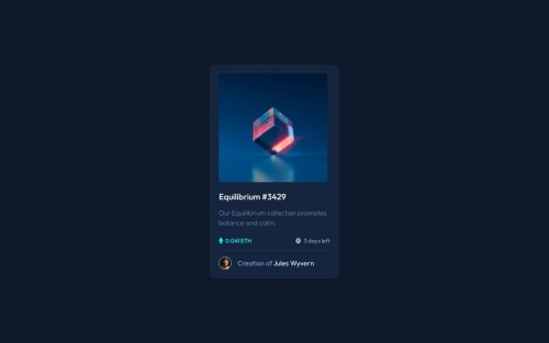
- Your solution resembles the actual design image from the challenge, this shows how much you've put your efforts to craft your solution to stand out from the rest ones, Congrats for that!
- I need to suggest to add a smooth-in-out transition effect during hovering the eye icon.
- Here's the example code,
.header { opacity: 0; transition: opacity .4s ease-out; } .eye-icon { transform: translate3d(-50%, -50%, 0) scale(1.5); opacity: 0; transition: transform .4s ease-out; } .img-container:hover .eye-icon { opacity: 1; transform: translate3d(-50%, -50%, 0) scale(1); }- These rules will help you to create a subtle transition effect which will boost your solution's User experience during hover.
.
I hope you find this helpful 😄 Above all, the solution you submitted is great !
Happy coding!
Marked as helpful - @R3ygoski
Hello Reza, congratulations on the project, it looks almost identical to the proposed design, my sincere congratulations.
Regarding your question about animations, you can achieve them in a few ways. One option is to add a subtle transition between states using
transition. Here's a link about it: W3School - Transition.Now, if you want to create a more complex animation, the best option would undoubtedly be @keyframes, as it allows you to create much more intricate animations. Here's a link about it: W3School - Keyframes.
As for a suggestion about your CSS, I noticed that the
cardhas a bit more spacing on the right. You could try changing itsmax-widthto 332px to make it more symmetrical. But this is just a suggestion.Again, congratulations on completing your first project here at FEM. Keep improving, and if you have any questions, please ask below, and I'll try to help as best as I can.
Marked as helpful


Join our Discord community
Join thousands of Frontend Mentor community members taking the challenges, sharing resources, helping each other, and chatting about all things front-end!
Join our Discord